Smudge! (comments)
Displaying 1 - 15 of 15 comments

Okay, I was going back over my layout 'favorites' and just found this one. You were right; this 'does' sound kind of bitter.
I sowwy. Forgive?xoxo
Dude, there are about 4 other layouts in this design from different people that I've just left comments under. One of the layouts had the same color splatter and the splatter was even in the same place on the layout. I don't know what I'm saying here so...let me be quite.

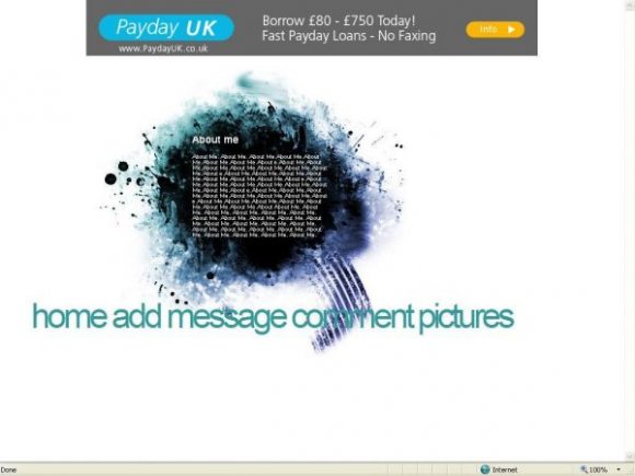
i cant see the aboyut me cause the letter r black how do i change them to white

The code for the navigation was wrong. I copied and pasted when I used it for the preview image.
Replace the XXXXXX with your friend ID

I agree the navigation is weird, but I also find that the text is a bit small. I like the black smudge & smears. Very nice.

both. unless you make the background dark grey. you should do the small navigation thing for this layout too.

Choice, should I make the navigation smaller or change the colours?
or both?

Love the colours... but I have to agree with Synesthesia - the navigation doesn't match... =/
=]
I love the colors of the smudge, but the navigation does not match at all. =/

I don't like the navigation. You should have used an Image Map.
Add Comment
You must be logged in to comment
Layout Details
| Designer |
Decode
|
| Submitted on | Jan 25, 2008 |
| Page views | 17889 |
| Favorites | 119 |
| Comments | 15 |
| Reviewer |
digitalfragrance
|
| Approved on | Jan 25, 2008 |