My Scar. (comments)
Displaying 1 - 20 of 22 comments

I love this layout. Who cares if the colors are diff.


I love your layouts. I use them all the time. This one has to be one of my favorites though ^^


i didn't add that code in. find a code that hides the navigation and place it on your about me.

I only have but one question...why doesn't the DIV cover the top navi; bar?
>>Aerrow-Skyknight

Ok, what can i possibly say about this layout other than IT IS PERFECT!!!???
I love the ammount of room and the setup, most little tiny divs suck and you cant fit any pictures or videos in them.
I would use this layout but the background is kind of depressing and i just got help for chronic depression, so it might worry my friends. Is there a possible way that you could re-make this exact layout with a different (still dark) background? I love it so much and ive never sen one as good as this!
I know how to change the background image but your terms say not tp so i will respect it and not try.
You are very very talented!

I like the layout. Along with basically all of yours :p
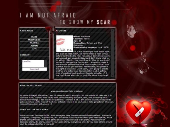
Although i kinda think the heart was a little much, but im using it anyways i like it

mollymonster. its alright, you may change anything within the content area itself just not the images. :)
I changed occupation to passion.. I hope that is alright.. Since I don't have an occupation.. uh... message me or e-mail me at lindsey_mattsen@yahoo.com if it wasn't and I'll change it back.

I love this one. Another great one! Keep up the good work. :]
im actually going to take off the striped background. :) thank you for your suggestions.

you should hide the top navigation "home, browse, etc" the image is very nice. it totally matches with the quote. i think it'd look better without the diagonal striped background. a more professional fonts would've been better for bold and navigation.

Add Comment
You must be logged in to comment
Layout Details
| Designer |
alecreations
|
| Submitted on | Jan 24, 2008 |
| Page views | 38119 |
| Favorites | 271 |
| Comments | 22 |
| Reviewer |
S-Majere
|
| Approved on | Jan 24, 2008 |