Designer's Comments
Look carefully for specific instructions
Okay so I've been putting this layout off for a while, but I finally got to doing it, I'm still new to the whole world of Photoshop, so yeah.
I'll be making a few more band layouts with this layout style.
Replace the XXXXXX's with your friend ID and fill in all of the info. I put the myspace music player as a little square, so you can still hide your music, but you can also pause it, so don't remove the credit and enjoy.
Brushes = Obsidian Dawn, Brushes.
Using This Layout
For specific instructions read designer's comments
- This is a div overlay layout, html knowledge required!
- 1. Log into myspace.com
- 2. Click on Edit Profile (Profile 1.0)
- 3. Copy (ctrl c) and paste (ctrl v) code to the specified fields
Layout Comments
Showing latest 10 of 16 comments

This is really good. I like the colors you used.
The only thing I would change about it is the navigation font. It's a little plain in comparison to your body text.
Marlon, you do awesome work. *favorite*

1024x768

The text is misaligned.
Although I refreshed the page, it's always misaligned.
What resolution did you use to make it?
Try refreshing the page.

The text is misaligned in FF. But I love the colors & the image. Very very nice.
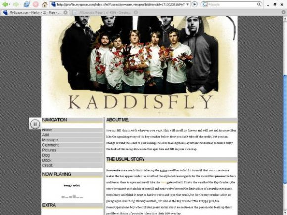
Thanks, I know they're awesome.I heard about them through my old teacher, his sons the guitarist for Kaddisfly, and sorry, I'm just learning to use Photoshop, and brushes are new to me

misaligned. try to move it to the right by about 7 px. (even in FF) in the screenshot, you didn't hide the music player, i think you should. the banner seems a bit plain. not sure about the brushes you used. overall nice structure. i like the colors. and the striped background doesn't seem bad at all.

Dude, I love this layout. the first time I had heard of Kaddisfly was in feb. of last year, when I saw them for Take Action. I gotta say, they're such a unique band, with the instruments they use and stuff. Bravo for this layout about them =]]
Alright then, it's all fixed on FF. Now I'm gonna go get it aligned on IE and post a link for that code.
This is misaligned in the CB preview, and I use FF. :/ It's a good layout, though.