Longing (revised) (comments)
Displaying 1 - 15 of 15 comments

beautiful layout. The only issue i have is that i cant insert the code for my playlist anywhere - it wont work.
for some reason it wont let me play my profile song ive never had this happen to me b4 and i think its becuz of the profile please how do i fix this

OOh i so love this layout.
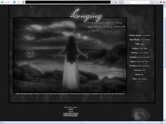
The image is amamzingly beautiful.
I love it!!
I so gotta use it.
~>Mz.Neisha

If you make your navi the same font family and the same font size the text won't jump. Also an underline on the hover may be helpful but most people realize those are links. I think you have done a wonderful job with this layout - it's looks great. Just some minor code tweaks... nothing big.
This layout is perfect for how I've been feeling lately. Thank you :) You're very creative and gifted.


Hi,
This is the MOST BEAUTIFUL div I've ever seen.....I'll be using this, do doubt about it!! Thank You for your Talent and Hard Work!
Much Appreciation..
~Belinda


use line-height so that the navigation doesn't move too much when you hover. try to keep the navigation shorter or make it go to the next line. im not sure about the structure. i think you can make the main image fade at the bottom. love the image and the roses. you should make the person glow and contrast more. nice job.

The image is beautiful, but the navigation is a major negative & strongly discouraged me from using this layout.

Very creative, I like it. But I think it'd be better if you used hex navigation or rollover navigation on it. Thats my opinion, because I like those forms of navigation the most.

I like the image. I find this really dark though. The navigation could be better, and its moving alot when I hover. The flower seems out of place. I am viewing this in IE and it is really misaligned. But I like the idea you were going for.

i dunno...i kinda find the about me section to be like floating. but other than that, i like the image you used and the colors. good work
Add Comment
You must be logged in to comment
Layout Details
| Designer |
mickaylal
|
| Submitted on | Jan 21, 2008 |
| Page views | 28426 |
| Favorites | 248 |
| Comments | 15 |
| Reviewer |
Relentless
|
| Approved on | Jan 22, 2008 |