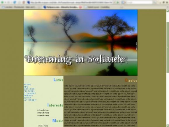
Designer's Comments
Look carefully for specific instructions
a spinoff of my personal solitude lyt on my myspace XD :
http://i90.photobucket.com/albums/k280/xrecclesz/3037e6d6.png
picture credits:
http://www.flickr.com/photos/adrian_valentin_murphy/381671928/
http://www.flickr.com/photos/adrian_valentin_murphy/440919412/
Blend by Me (:
**replace all the xxxxxx's with your friend ID .
http://i90.photobucket.com/albums/k280/xrecclesz/3037e6d6.png
picture credits:
http://www.flickr.com/photos/adrian_valentin_murphy/381671928/
http://www.flickr.com/photos/adrian_valentin_murphy/440919412/
Blend by Me (:
**replace all the xxxxxx's with your friend ID .
Using This Layout
For specific instructions read designer's comments
- This is a div overlay layout, html knowledge required!
- 1. Log into myspace.com
- 2. Click on Edit Profile (Profile 1.0)
- 3. Copy (ctrl c) and paste (ctrl v) code to the specified fields
Layout Comments
Showing latest 4 of 4 comments

hey can you do the same thing just make the comments show on the right side of the layout under the comment box
By jose09 on Feb 6, 2008 12:30 am
I agree, the background colors dont match the image. But i like that. It gives it more contrast. If the background colors matched the image, the image wouldnt stand out.
By bsbulisticcc on Jan 28, 2008 2:13 am

I really like the colors in the photo!
-Colors Reflected-
By Sw33tT3mptation on Jan 24, 2008 4:35 am

this layout is similar to miyashu's...like how the first letter is different color. it's structured nicely. i like the image. i don't like the font. the background colors you chose don't match with the image.
By twodreamlovers on Jan 22, 2008 4:18 pm
Layout Details
| Designer |
xRecclesz

|
| Submitted on | Jan 21, 2008 |
| Page views | 17,321 |
| Favorites | 113 |
| Comments | 4 |
| Reviewer |
Relentless
|
| Approved on | Jan 22, 2008 |