Designer's Comments
Look carefully for specific instructions
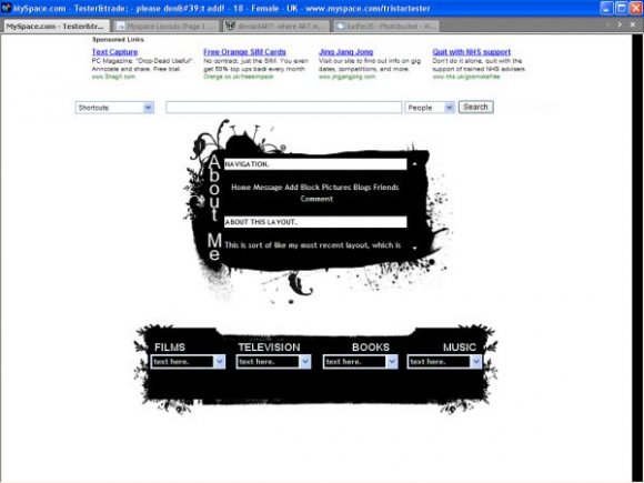
Plain black and white flower layout.
I might use this myself actually! (I never usually use my own layouts... well, the ones that get accepted really!)
Please read the layout instructions - they'll help you!
XD
ONLY TESTED IN IE. SORRY IF IT LOOKS RUBBISH IN FIREFOX! (My dad won't let me download FireFox! Grrrr!)
(Brushes from http://ewanism.deviantart.com/)
Using This Layout
For specific instructions read designer's comments
- This is a div overlay layout, html knowledge required!
- 1. Log into myspace.com
- 2. Click on Edit Profile (Profile 1.0)
- 3. Copy (ctrl c) and paste (ctrl v) code to the specified fields
Layout Comments
Showing latest 9 of 9 comments

It's rubbish on Firefox '-'

Really like the brushes, but not so much the bottom part. I think you could have taken that and combined it into the top box and it would look better.

good concept, alittle repeative, it flows good but trying using some different fonts and avoid using all CAPS it makes it harder for the eye to read it.

Really like the simplicity and how you organized the "television, books..." and what not.

i love the brushwork. but i would rather see "about me" in a more interesting font.

I love this layout because it's weird.
Note:I mean it in a good way.
Ooooooh, and minimal is my style so it's perfect to me.

i love where the books and movies etc. are.

nice. i like the brushes. im jus not sure about the structure. it makes the layout look plain rather than simple.

Creative concept, but I am not a big fan of it. But still pretty good. I will favorite it anyways.
Layout Details
| Designer |
PaintMyFace
|
| Submitted on | Jan 18, 2008 |
| Page views | 38,242 |
| Favorites | 198 |
| Comments | 9 |
| Reviewer |
freeflow
|
| Approved on | Jan 19, 2008 |