stars (comments)
Displaying 1 - 12 of 12 comments


i love this layout but i cant get it to my myspace. it keeps coming out white. please help!!!

Roll-overs would help.
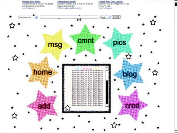
The dots kills my eyes. If you just used solid colours instead of making it all dotty, this layout would've been a whole lot better, sorry. >

if the colors were just a solid color, it would look better...or maybe it's just bad quality?
sorry to repeat what others have said, but rollovers would help a lot.
it's cute, though.

wow i love the stars :)
but maybe the image needs something more, don't get me wrong..
i like it ((:

i like its simplicity. bad quality for image. rollovers needed. the stars and everything just make it look plain.
I don't like the stars a whole lot, actually. The content DIV should be in the exact center of the box.

The pattern in the stars strains my eyes. I think a more solid pattern would look nice and with some rollovers. This is cute though. :o)

the image itself does not look that good. the image quality of it i mean. The navigation could use some work as well, maybe rollovers? Overall i like the theme you were going for. :) pretty nice!

Add Comment
You must be logged in to comment
Layout Details
| Designer |
seductionlayouts
|
| Submitted on | Jan 18, 2008 |
| Page views | 39906 |
| Favorites | 446 |
| Comments | 12 |
| Reviewer |
S-Majere
|
| Approved on | Jan 18, 2008 |