Zero No Kotae(UVERworld) (comments)
Displaying 1 - 11 of 11 comments

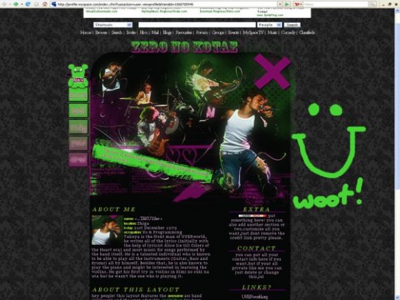
From a distance, this looks like a hot mess. When I clicked the full preview, however, it looked really good.

omg i loooove dis layout sooooo much!!!!! i would sooo use this if i knew dis band


UVERworld! Haha, the colors don't match usually, but you pulled it off to create a unique- and awesome- layout.

i was gonna say i really hope that woot isnt there lol.
i like the image, and the font selections.

i dont know who they are but this is really awsome! the colors and the image goes really good together! :] great job :D
rollovers woulda put this over the top and it is not centered in ff


i think you could've taken out the bg img, since it doesn' really match. rollovers. nicely structured. not sure about the colors. too much?

wow i love this. there's lots of energy in the pic & the colors really bring out that energy. the nav is cute too!
i only listened to 3 uverworld songs @__@ and i like their sound.
Add Comment
You must be logged in to comment
Layout Details
| Designer |
Saikou
|
| Submitted on | Jan 15, 2008 |
| Page views | 29473 |
| Favorites | 94 |
| Comments | 11 |
| Reviewer |
Relentless
|
| Approved on | Jan 15, 2008 |