Shadow Of The Day (comments)
Displaying 1 - 12 of 12 comments


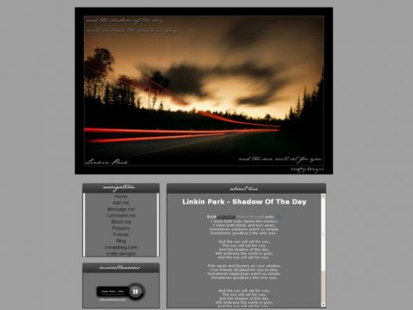
the banner is bigger than the blog is, which is kind of a turn off.. the layout background should be black also, to match he banner. If you add that, it would look much better.

i dont know why you people complain. its basic html, can the colors for F$%^s sake.


ya i agree with everyones comments. The content area and the picture are too different in color and the image is way to large. If it was different, I would use this because this is my profile song =/
Um would you be able to tell me how to make the picture smaller...send me a message please?

the image is pretty but the vibrant colors there conflict too much with the dull colors below. in other words...what twodreamlovers said xD

it dosent seem to match to me =/ but its pretty cool still :D

very nice. the image and the content seem too distinct from each other (color, structure)

Add Comment
You must be logged in to comment
Layout Details
| Designer |
crafty-designs
|
| Submitted on | Jan 15, 2008 |
| Page views | 35642 |
| Favorites | 239 |
| Comments | 12 |
| Reviewer |
Relentless
|
| Approved on | Jan 15, 2008 |