Sweet as Candy (comments)
Displaying 1 - 20 of 22 comments

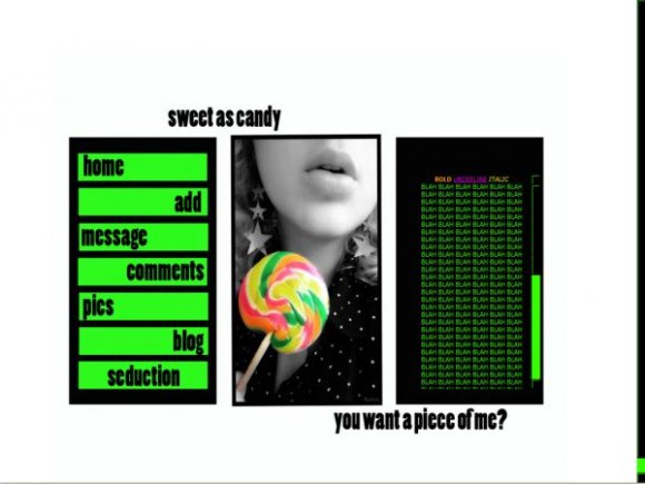
i love this pro, i don't care what anyone else says. Pink would look good, but the neon green, i just love. it would need to be a certain pink as well, or it would just look really bad.
the only problem is that the blog button does not seem to work. i do understand some HTML but i'm still a beginner, so any help would be awesome.


If they knew HTML then they wouldn't be using this layout or anyone elses, they'd be making their own. It's called common sense smart one.

If you people knew HTML, you could change the add button resource, in stead of whining. morons.
nice work. i really like it

the add doesnt work... and i want the page cuz its sooo cute
IF SOMEBODY TRYS TO ADD ME IT DONT WORK BUT EVERYTHING ELSE WORKS FINE... WHATS WRONG!!!

yea the add and the blog button doesnt work for me either but what the hell, i still used it!


i think this needs more color, but not so bright. for example, just take colors from the lollipop and incorporate it into the layout more.
the image is so cute, so if you decide to redo this, keep the image the way it is. i also like how the layout is organized. :)


how do I make the left side of the layout show on my profile

I agree with twodreamlovers, pink would have looked better since there is no purple anywhere else. definetly needs rollovers! The colors are a little bright for my taste, but good job overall.

not likeing the brighto colors or the font either but love the styloe. maybe re-do it and tone it down and change the font, then i'd definately use it.

I like the layout, but not the colors or font. Pastel or bright (not so much neon bright) would have looked better, with more of a focus on gray than the black. And a scripty font would have played well into the whole candy theme.
Add Comment
You must be logged in to comment
Layout Details
| Designer |
seductionlayouts
|
| Submitted on | Jan 14, 2008 |
| Page views | 44802 |
| Favorites | 373 |
| Comments | 22 |
| Reviewer |
alovesopure
|
| Approved on | Jan 14, 2008 |