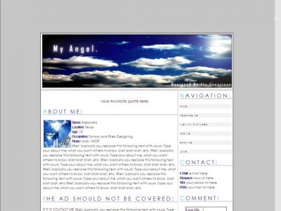
My Angel (sky) (comments)
Displaying 21 - 30 of 30 comments


Nice image and setup, but I don't like the navigation link size or font.
Posted by tokyo-rose on Jan 13, 08 7:52 pm

i like these new layouts you're submitting :). they have that simple, elegant look to them.
Posted by miyashu on Jan 13, 08 7:34 pm


lol, its alright. and thanks for comments and suggestions.
Posted by alecreations on Jan 13, 08 6:57 pm

ohh sorry :] just saw you said "the ad should not be covered in myspace" =]
Posted by joespace on Jan 13, 08 6:52 pm
it'd be better as a website template :\
It looks awesome.
I don't like the nav links though :\ they're too spaced out. make them thicker and next to each other.
Also, howcome it's so far down? set it to 90px from the top :] and show the addddddd! lol
Joe.
Posted by joespace on Jan 13, 08 6:51 pm

« Prev ·
Page 2 of 2
Add Comment
You must be logged in to comment
Layout Details
| Designer |
alecreations
|
| Submitted on | Jan 13, 2008 |
| Page views | 38479 |
| Favorites | 233 |
| Comments | 30 |
| Reviewer |
Relentless
|
| Approved on | Jan 13, 2008 |