Angels Falling (comments)
Displaying 21 - 35 of 35 comments

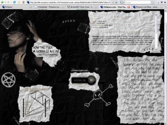
i like the image and its concept. the tables seem too distinct from each other. the comment box and the navigation is barely visible. remember to display block for the navigation links. try to make another layout that doesn't involve crumbled papers cause i've seen them a lot. it's getting pretty old now.

I'm actually in love with this layout.
LOL my layout got rejected for havin the f word in it.
haha.
Any idea where you got the brushes for the kinda screwed up paper and sticky tape?
Also the song is topp!
=)

I think the navigation should've been black and not blue, but other than that I love this. Very good work.

the navigation is hard to read; other than that. its awesome! :)


if you'd like to get rid of the player press ctrl F and type in "music" the code starts with the word center just delete that! :D
if you still need help then comment me =]

i like this layout (and ICP)
but its a bit hard to get everything just right on my profile, like getting rid of the audio player that comes with it. any tips?


Very interesting. I like the note written on the paper (lower right-hand corner).


Add Comment
You must be logged in to comment
Layout Details
| Designer |
none345678
|
| Submitted on | Jan 11, 2008 |
| Page views | 54022 |
| Favorites | 412 |
| Comments | 35 |
| Reviewer |
sweetasphyxia
|
| Approved on | Jan 12, 2008 |