Designer's Comments
Look carefully for specific instructions
Yet another new-stlye layout for me. =]
It was quite "productive" for me, to be honest! I mucked around with the navigation for a bit, but then decided upon that.
I don't think the white font really works, but it's better than any other colour I could find/use.
Only edit the WHO I'D LIKE TO MEET part. NOT the about me part!
PLEASE READ INSTRUCTIONS ON THE LAYOUT. (They will help you muchos!)
Just in case you didn't see it, CHANGE THE XXXXXXX'S WITH YOUR FRIEND ID PRIOR TO PRESSING "SAVE ALL CHANGES"!!!
Other than that, enjoy the layout, don't take off the credits (to anyone) and yeahh. Edit where I've written to make it your own. =D
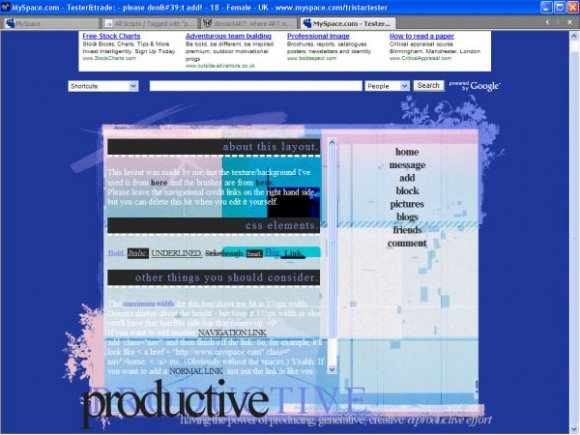
This layout was made by me, but the texture/background I've used is from http://hybrid-genesis.net/ and the brushes are from http://www.ewanism.deviantart.com/.
It was quite "productive" for me, to be honest! I mucked around with the navigation for a bit, but then decided upon that.
I don't think the white font really works, but it's better than any other colour I could find/use.
Only edit the WHO I'D LIKE TO MEET part. NOT the about me part!
PLEASE READ INSTRUCTIONS ON THE LAYOUT. (They will help you muchos!)
Just in case you didn't see it, CHANGE THE XXXXXXX'S WITH YOUR FRIEND ID PRIOR TO PRESSING "SAVE ALL CHANGES"!!!
Other than that, enjoy the layout, don't take off the credits (to anyone) and yeahh. Edit where I've written to make it your own. =D
This layout was made by me, but the texture/background I've used is from http://hybrid-genesis.net/ and the brushes are from http://www.ewanism.deviantart.com/.
Using This Layout
For specific instructions read designer's comments
- This is a div overlay layout, html knowledge required!
- 1. Log into myspace.com
- 2. Click on Edit Profile (Profile 1.0)
- 3. Copy (ctrl c) and paste (ctrl v) code to the specified fields
Layout Comments
Showing latest 10 of 12 comments

looks pretty cool.
By Mikeplyts on Jun 23, 2009 8:39 am

it's cool
By Janess on Dec 26, 2008 11:07 pm

I like this, but I would like it more had it been all DARK colors =)
By dilligrout on Nov 2, 2008 11:07 am

ohh purdy ;3 colorful xD
By fallenxdreams on Jan 16, 2008 7:20 pm

The colors definitely caught my eye. ;D
By BubbleDelights on Jan 13, 2008 10:29 pm

i agree with the comments about the text- otherwise, this is great! i love the blue! it's very nice.
By sagerose2003 on Jan 12, 2008 9:22 pm

This is very nice. It's a little hard to read in my opinion.
By jesusisthebestthing on Jan 12, 2008 8:32 pm
Wow, I like the colors. :) Just fix the font and navi and it'll be perfect.
By tokyo-rose on Jan 12, 2008 7:14 pm

i dislike the font and navigation; other than that i love the theme/ concept you were going for. :)
By alecreations on Jan 12, 2008 7:00 pm
ba da ba ba ba
im luvin♥
By escapethefallout on Jan 12, 2008 11:11 am
Layout Details
| Designer |
PaintMyFace
|
| Submitted on | Jan 11, 2008 |
| Page views | 15,825 |
| Favorites | 96 |
| Comments | 12 |
| Reviewer |
sweetasphyxia
|
| Approved on | Jan 12, 2008 |