Cheech &Chong (comments)
Displaying 1 - 20 of 20 comments


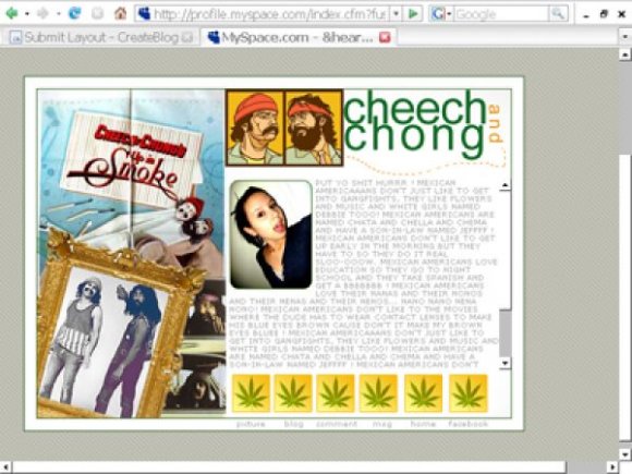
http://profile.myspace.com/ind ex.cfm?fuseaction=user.viewpro file&friendid=18009917&MyToken =ac184735-cc6f-40c3-b886-89795 49de64c
that's what it looks like when you actually use it on myspace, the links work fine &are lined up
it's to the side because that's just how i like it positioned, you can easily move it over if you'd preferrr

the layout is good but it goes too much to one side and the regular nav box is under the layout and i can still see it how can i fix it the links dont work also
awesome xD
can you possibly make one
in standard form?
good job :]

LLOVE ITTTT.
:]
i think the navs should have had something to tell them apart but its great.

Twodreamlovers' grammar gotta go.
Personally, I like this and
I think it's really cool!
I just don't like the way the
navigation is set up, I see
someone said something about
it not working and that's
probably because of the way
you set it up.
However, I like it =)

navigation links dont work. everything don't match. the background image gotta go.

omgg this promotes the use of illegal drugs!!11
LOL kidding. Awesome work.
Um...that's a div overlay; not a standard. lol.
Besides that: awesome layout.
:D
Kudos.


This took me waaaay back. The marijuana leaves are a nice touch. Great work.


yeah this is pretty much the shit! i love there movies :D really7 good job i might use this =]!

the only thing that bugs me about this layout is the navigation not having rollovers. it would have been better. other than that; great job. :)

Yeah the images are not aligned with the words for the nav. That is really the only bad part.

This is nice, just that in the preview the worded links are not aligned with the image, and they are pink...
Add Comment
You must be logged in to comment