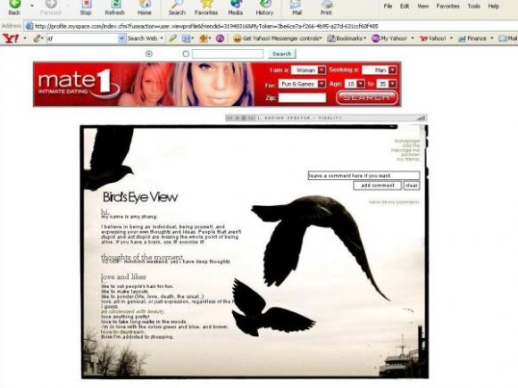
bird's eye view (comments)
Displaying 1 - 13 of 13 comments


this layout is beautiful. so simple but its very powerful too.

i dislike the navi and the font
but i really like the image

twodreamlovers, just erase the 's and the white background will go away. ;)
it's all a little shifted.. the links on the right are. plus, yeah, the words in the 'caption' are scattered together.


move the birds more to the right so that the black font is visible and in FF, the font has a background color so the bird looks chopped. try to make the textarea same width as the buttons. very nice. btw, make the font bigger for the ppl with bigger screen.

this is my 2nd layout that worked. (i'm first timer hear and I deen trying lots if layouts and they did not work) I love the layout. keep it up.


beautiful, although i think the nav could've been more interesting.

i dislike the font; a little hard to read as well as the navigation. but i like the theme overall. :)
Add Comment
You must be logged in to comment
Layout Details
| Designer |
smileyamers
|
| Submitted on | Jan 8, 2008 |
| Page views | 24350 |
| Favorites | 149 |
| Comments | 13 |
| Reviewer |
libertie
|
| Approved on | Jan 9, 2008 |