Designer's Comments
Look carefully for specific instructions
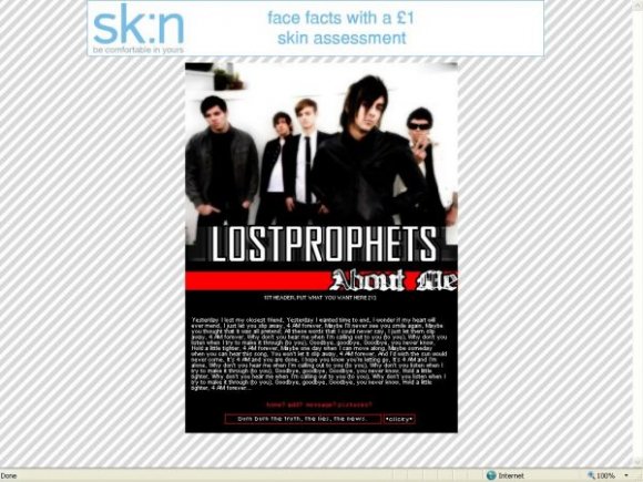
Note: The layout looks like the screenshot, not like the preview!
Using This Layout
For specific instructions read designer's comments
- This is a div overlay layout, html knowledge required!
- 1. Log into myspace.com
- 2. Click on Edit Profile (Profile 1.0)
- 3. Copy (ctrl c) and paste (ctrl v) code to the specified fields
Layout Comments
Showing latest 10 of 10 comments

it's supposed to be like that sebcglbailey.
it makes it cool :D

Everyone's a critic -___-;

i don't like the background image. make the main font bigger so that ppl with bigger screen can read it. you should make banner and header font same. nice image.
bangxdisco, try reading the designer comments.
Drama, if you meant the actual about me I used arial, if you meant the words introducing the about me with the red background, then bill hicks.

i like it pretty good!
what font did you use for the about me ? if u dont mind me askin =]

The photo's cool, but maybe it would've looked better if used a background image..

um
in ff, not everything's hidden.
can still see the url, interests and details.

i just heared like one song from them
but i think they're great :)
cool layout

The heading could be more interesting, but apart from that I love it & I love that band. They're soooo good live, even my mum loved them when she saw them x]

the image looks blurred? =s lol
other than that cool (y) i love lostprophetsss XD hehe
oh and you spelt lps without the h in the tags. =p