Geometrical (comments)
Displaying 1 - 19 of 19 comments

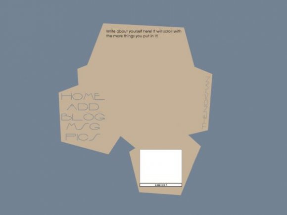
Don't hate me, please...but this is terrible. I know you worked hard on this and I see the idea that you are going for - a flattened cardboard box that's opened, I think. And then the font isn't attractive (to me; other people may think it's great. To each his own).

hi, i really like this different design. is there any way os fetting it up by having your friends show up on the profile page?

I really really like this.
its wonderful and I love the shape and color scheme

Unique.
Dunno why I like it, but it's going in my favorites. :)

rollovers. i get the fact it's minimal but this isn't simple. it's plain. the color combination isn't good either.

Contrary to a lot of people; i love it. :) i love the colors, the navigation, the font, the space, and the comment box. Its unique; simple, and the colors fit everything. great job!
Oh, and to the people who have complained about the simplicity: This was submitted as a minimal layout.! :P
I agree with bangxdisco about the comment box being so far down, but it's probably because I'm not used to it. It's a decent and unusual layout. :]

I know.
I am so happy this one got approved because so many of my others were rejected and they were almost the same! =P

Whoa it's all hexagon-y.
ignore the haters,a lot the people that bitch the most don't even make layouts.

I love this. It's so original and simplistic- exactly what I look for and hardly every find in a layout. It looks put together too, not too disjointed. Nice work. (=

roll overs woulda helped alot. and i find it more plane then simple but i like the colors and the font for the nav!

christalface...is MEAN D:
i like it, but i do think its a bit plain. more could be done to it, although im afraid that it might break the simplitcity of it all :[ maybe just different colors? like brighter?

IGNORE THE COMMENT BELOW, WHOEVER IT WAS HE IS JUST JEALOUS 'CAUSE IS PRETTIER THAN HIS/HER FACE...
I THINK IS REALLY ORIGINAL AND I LIKE THAT IS VERY SIMPLE


i think it's way too plain. and the comment box seems out of place.

I like the font used for the navigation and I like the space available. However, I think the colors are a bit plain and the layout really doesn't stand out to me.
Add Comment
You must be logged in to comment