Designer's Comments
Look carefully for specific instructions
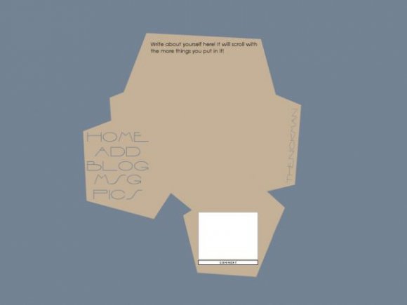
Edit only what is in the "Who I'd Like To Meet" section.
Comment box credit to: Insurmountable.
Works in all screen resolutions.
Enjoy!
Using This Layout
For specific instructions read designer's comments
- This is a div overlay layout, html knowledge required!
- 1. Log into myspace.com
- 2. Click on Edit Profile (Profile 1.0)
- 3. Copy (ctrl c) and paste (ctrl v) code to the specified fields
Layout Comments
Showing latest 10 of 19 comments

Don't hate me, please...but this is terrible. I know you worked hard on this and I see the idea that you are going for - a flattened cardboard box that's opened, I think. And then the font isn't attractive (to me; other people may think it's great. To each his own).

hi, i really like this different design. is there any way os fetting it up by having your friends show up on the profile page?

I really really like this.
its wonderful and I love the shape and color scheme

Unique.
Dunno why I like it, but it's going in my favorites. :)

rollovers. i get the fact it's minimal but this isn't simple. it's plain. the color combination isn't good either.

Thank you!

Contrary to a lot of people; i love it. :) i love the colors, the navigation, the font, the space, and the comment box. Its unique; simple, and the colors fit everything. great job!
Right on Synesthesia! LOL
Oh, and to the people who have complained about the simplicity: This was submitted as a minimal layout.! :P
I agree with bangxdisco about the comment box being so far down, but it's probably because I'm not used to it. It's a decent and unusual layout. :]