Lost Time (comments)
Displaying 1 - 19 of 19 comments

I love this but it comes out all screwed up on my myspace
how come people cant see my pictures...is there a certain way i have to do it?

i absolutely love this page! amazing job! genius!!! However, i was wondering how can i modify it to put it on a myspace music page. I tried to combine both codes together and put it under Bio info but it didnt work. any suggestions? id greatly appreciate it

I love it, but I'd love for it to be a little cleaner and to scroll a bit... and for a block button.

Would you be able to add a comment space, that shows the comments? Possibly underneath the layout? If so, that'd be really awesome. Thanks for your time. And GREAT layout. Really speaks to me.

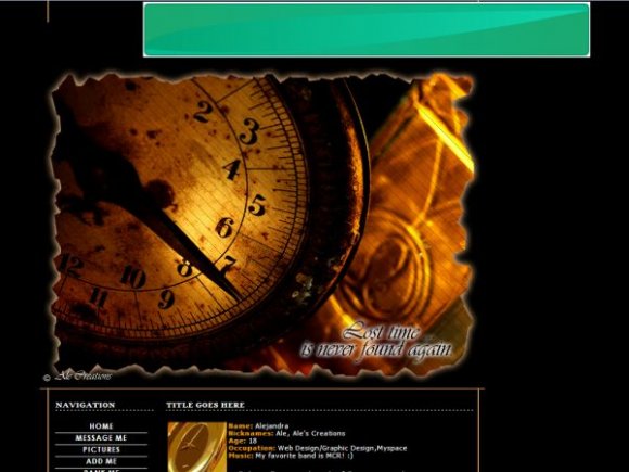
jwilliams1er: everyone is entitled to their own opinions. I MADE IT LIKE THAT BECAUSE I LOVE THE PHRASE AND TO ME IT MATCHES THE PICTURE PERFECTLY. You are right, art should speak for itself, but not all the time. Not for me. So, i apologize that your that ONE person who dislikes the phrase, and like i say all the time, i will not change a tiny thing because ONE person said so.
But i appreciate that you found the time to say something of the matter.
- Ale
This lay out is completely hot xcept for the lost time part why would anyone want that on there layout? I mean hat mean something for you but it doesnt mean anything to me art should speak for it self... no offence the lay out is still hot but man you should remove the words I wouldnt use it just because of that.
thanks for your comments and suggestions!
TheNickMan I'll try to fix it. :)

I love the organization of the layout, but the image is too large for me...I think the lyt would've been better if you only had the quote

Yeah the image is good, but the friend links overlap and the images are positioned over the ad and its not centered.
Use the URL to learn how to center div's.
http://pill-pop.net /content/tutorials/centerdiv.p hp
If there are any spaces in the link, remove the spaces.


the search bar is hidden. I didn't want to put glow around the image itself but then it looked kind of too dark. I always go for plain simplicity lol. I didn't want to do much to the picture itself. I auto-contrast it, did the border, and added a simple line background over it.

by the way, did you hide the search bar? because it's going to overlap the image.
you shouldn't done glow for the outside of the image. like the glow for the font though. structured nicely. it seems too plain though. try doing something more interesting with the image. add more to it. nice job.
thank you. & yeah i was thinking of doing a layout of time weeks ago but i managed to do it today. :)

awesome, exacly yesterday i was looking a layout about time, and i found it tosay!!! awesome
Add Comment
You must be logged in to comment
Layout Details
| Designer |
alecreations
|
| Submitted on | Jan 6, 2008 |
| Page views | 31087 |
| Favorites | 290 |
| Comments | 19 |
| Reviewer |
brooklyneast05
|
| Approved on | Jan 6, 2008 |