Drive there Now (comments)
Displaying 21 - 30 of 30 comments

I'm not sure about being inspired by miyashu....looks like a direct copy to me. Try using your own style and working on that rather than the ideas of other designers.

Ooo. I think I accidentally used black on the rollovers instead of the background color. whoops. i'll take care of that later. Thanks for letting me know bout that.

this is real nice
if you keep improving on this style then i think youll get pretty big on here
just work on the rollovers a little more and watch what fonts you use =]
i still might use this though one day though :D

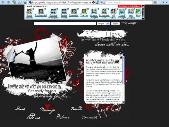
comment background isn't needed. i can understand you're new at rollovers. i can see that when you hover, the background color is different. keep trying. it'd be better if each link had different hearts. this is actually nice. except i don't like the fonts (except for the navigation one) however, you're improving lots. keep up the good work.

i mean this in the most polite way possible:
did you draw inspiration from my "stay beside me" layout? i'm just wondering, and i have no problem with it if you did :).
this is very pretty, but the content area looks too small. also, when you're working with text, try to stick with 2 or 3 fonts so it doesn't look overwhelming. nice job on this ^.^
Yeah. I was skeptical about the comment box background too.
I'm looking for something to replace it with though.

Another nice layout. :) I guess you should change the comment box's background and then it'll all be good. The rollovers are pretty!

I agree about the comment box;however, I love the navigation hovers and the whole theme of it. Great Job.

I like this, but the comment box background seems....out of place? Anyway, good job :]

I love it, except for the comment box seems awkward. The box's background doesn't seem right. But other then that, it is a great layout!
Add Comment
You must be logged in to comment
Layout Details
| Designer |
gracepooh91
|
| Submitted on | Jan 2, 2008 |
| Page views | 67880 |
| Favorites | 608 |
| Comments | 30 |
| Reviewer |
freeflow
|
| Approved on | Jan 2, 2008 |