A Lack of Color (comments)
Displaying 21 - 23 of 23 comments

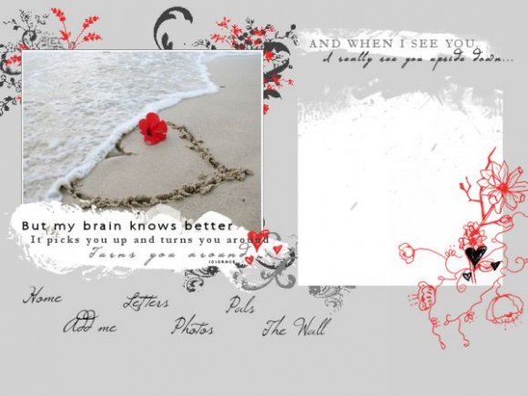
i agree with miyashu about the red brushes. you could've done an awesome rollovers with the navigation. your comment box is messed up. the layout is beautiful and best out of all your layouts. you improved a lot. however, the image and the content area seems distinct.
Posted by twodreamlovers on Jan 1, 08 6:36 pm

i think you could do without those red brushes on the right. pretty layout.
Posted by miyashu on Jan 1, 08 6:31 pm
« Prev ·
Page 2 of 2
Add Comment
You must be logged in to comment
Layout Details
| Designer |
gracepooh91
|
| Submitted on | Jan 1, 2008 |
| Page views | 59974 |
| Favorites | 540 |
| Comments | 23 |
| Reviewer |
S-Majere
|
| Approved on | Jan 1, 2008 |