See the World (comments)
Displaying 1 - 15 of 15 comments

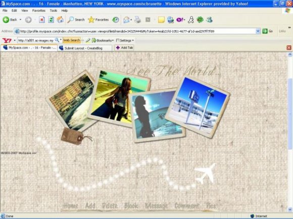
the image isn't exactly centered in FF, but the design is nice =)

love to use this but with my own pics how could i change photos on page?

i really like it. the font and pictures are beautiful!

i love love this layout.
the pictures are so nice.
yeah, it looks better now after you resized them. awesomeee.
I agree with tainted-twilight. That could be changed by having the plane and its trail maybe overlapping the banner photos a little. It's a nice layout though..

what are rollovers? and yea I know. I just didn't want the layout looking to plain.

i really love this however i think the gap between the banner and the content area is a bit too much because of the plane. If it were smaller, i think i wouldve liked it better

okie doke. i tried to fix as much as i could without completely redoing it. I had the image a lot bigger than it was but photobucket resized it for me. I made the background scroll and i changed the fonts. If you guys still don't like the bg when it scrolls, then i'll change it (:

yeah, the background is a bit out of place.
i also don't really like the font u used for "About Me" and the navi.
but otherwise, it's very nice ^^

the bg looks out of place; i would suggest to replace it or remove it completely. maybe this layout would look better with just a nice plain color for the bg :]. everything else looks fine, i love how the palm trees frame the content; great idea!

make the background scroll. everything don't seem to match up. i think you should take out the airplane (cause you can barely notice it) and put the picture near the content area. i like how you arranged the pics. choose a different font family and color for "see the world" barely noticeable. i don't like the colors for the navigation and about me. take out the body background image from the content area. i think you shouldn'tve had a background image in the first place. i think then it would've looked a lot better and it's easier to manage. however, i like the simplicity of this.

Great concept, the pictures could have been slightly larger though and the scrolling background looks a little odd.
Add Comment
You must be logged in to comment
Layout Details
| Designer |
smashedcodes
|
| Submitted on | Dec 30, 2007 |
| Page views | 42414 |
| Favorites | 323 |
| Comments | 15 |
| Reviewer |
S-Majere
|
| Approved on | Dec 31, 2007 |