Bona Fide (comments)
Displaying 21 - 25 of 25 comments

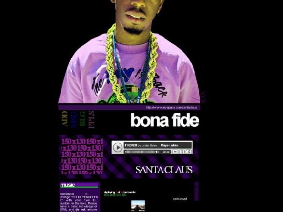
awesome!the only thing that bothers me is that the image covers some of the ext. network.other than that this kicks ass.

I think "home" is supposed to be in the top left. So, it's not misaligned - I don't think. The layout is nice, but the head of the person in the image should either be up a little further so that we can't see the obvious cut of the head, or the entire head should be there. =) Either way, you've done a wonderful job! =)

why's the guy's face cut off? and if you were going to do that, you should have centered this. and make sure u don't cover part of the ad. the link for home is mislocated. it's in the top left corner. i think you could've done something with the image like make him glow or brushes. i like the rollovers though. the location for the comments is a bit weird. i think it'd look better under the about me section. nice structure and color though :)

It looks kind of crowded in a way, i dislike the cut-off image in my opinion. other than that, its pretty good.

this is sooo freakin hot! i love the image. im a hip hop head, so this is perfect for me...can i delete the comment section though???
Add Comment
You must be logged in to comment
Layout Details
| Designer |
superednerd
|
| Submitted on | Dec 30, 2007 |
| Page views | 40591 |
| Favorites | 133 |
| Comments | 25 |
| Reviewer |
IVIike
|
| Approved on | Dec 30, 2007 |