Aqua Flash (comments)
Displaying 1 - 12 of 12 comments

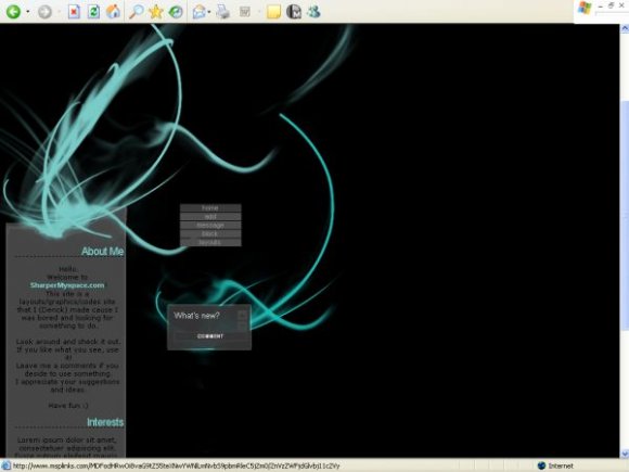
Mmm nice :) But It'd be better if the main text weren't in bold.

Content area should be wider.
Other than that Very nice job.
The colors are really nice, and I like the minimal-ness :D

I would definitely be more likely to use this overlay if it were centered more and if there was more content space. But either way, the colors are beautiful and the overall look of the lyt is elegant. Very nice work..

it is a bit small, but i really like the iridescent blue-green ;] and the navigation. nice job!

I dislike that its really small. Other than that, its creative and unique. i like it. good job.

Maybe I will make another one like this, but as a website template!

Yeah I really like this too. Just make the areas wider. So it can be used as like a website template!


a wider content area would've been better, so the navigation doesn't look like it's floating. i love the colors. btw, this covers part of the ad. nice brush. :D
Add Comment
You must be logged in to comment
Layout Details
| Designer |
SharperMyspace
|
| Submitted on | Dec 30, 2007 |
| Page views | 32082 |
| Favorites | 156 |
| Comments | 12 |
| Reviewer |
IVIike
|
| Approved on | Dec 30, 2007 |