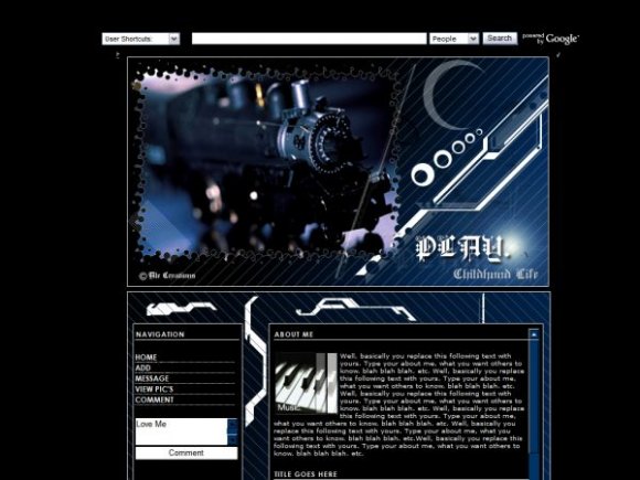
Designer's Comments
Look carefully for specific instructions
e-mail: ale@alecreations.net
website: http://alecreations.net/tutorial.php
DO NOT STEAL MY CODING AND/OR EXACT IDEAS; AND DO NOT REDISTRIBUTE. IF I SEE A LAYOUT OF MINE AND YOU CLAIM IT AS YOURS, I WILL DO WHATEVER IT TAKES TO HAVE IT REMOVE.
Using This Layout
For specific instructions read designer's comments
- This is a div overlay layout, html knowledge required!
- 1. Log into myspace.com
- 2. Click on Edit Profile (Profile 1.0)
- 3. Copy (ctrl c) and paste (ctrl v) code to the specified fields
Layout Comments
Showing latest 5 of 5 comments

This is seriously cool. I love the image, colors, and everything.
Great navigation. The comment box background are probably should've been black or blue with white text, like the about me content area. Other than that, I think you've done a pretty good job with a great use of space which gives users a bit more freedom to express themselves. Very nice =]
other than the nav it's pretty tight.
very nice. i think you should take out the comment box. try using height or padding for the navigation links so it won't move up and down when you hover over them. it'd be better if the banner and the content were the same widths. too much space at the bottom. apart from that, flawless. great job =]
nice roll overs :3
Layout Details
| Designer |
alecreations
|
| Submitted on | Dec 27, 2007 |
| Page views | 18,379 |
| Favorites | 62 |
| Comments | 5 |
| Reviewer |
karmakiller
|
| Approved on | Dec 27, 2007 |


