Designer's Comments
Look carefully for specific instructions
I don't care if you alter the code for your own, personal use, just don't redistribute it or claim it as your own.
Change "XXXXXXXXX" to your Friend ID! (there are a bunch of these you have to do) Do this BEFORE you click save!
The first section is for your picture. Change "IMAGE URL HERE" to the URL of your default picture.
Check out my other layouts?
Using This Layout
For specific instructions read designer's comments
- This is a div overlay layout, html knowledge required!
- 1. Log into myspace.com
- 2. Click on Edit Profile (Profile 1.0)
- 3. Copy (ctrl c) and paste (ctrl v) code to the specified fields
Layout Comments
Showing latest 9 of 9 comments

*SharperMyspace*..You have
the best layouts!

Do you teach anybody how to code a div overlay?

ooh i like this layout(:

when I make layouts, I make things that I would use in real life. I make layouts that appeal to me. And obviously they appeal to more then just me, cause 12 people have favorited this layout.
and I don't really care if people don't like them. I make layouts just cause I am bored.

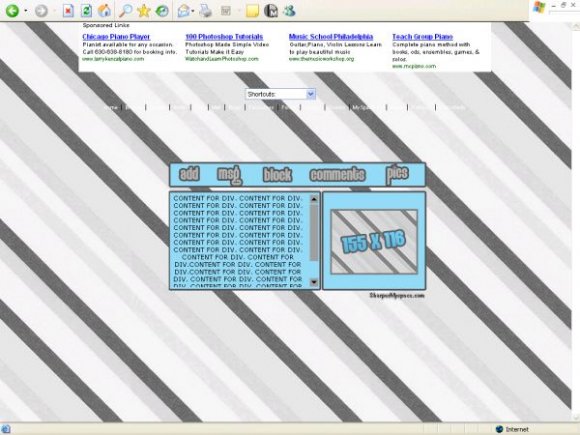
stripes arent so good looking...

I dislike the color choices in this one. and the background is kind of misaligned.
If you don't like the background I made, then use a different one. I don't care if you edit the code, just leave the credit.

the stripes are not alligned.
you must have a small screen but for anyone with a large screen the stripes are not alligned.

i think you should pick a different background image. make the navigation width bigger so it'd be the same with the contents. instead of a simple background, a simple banner would've been nice. so that it'd look simple and nice and not plain. i like the color blue though.
Layout Details
| Designer |
SharperMyspace
|
| Submitted on | Dec 27, 2007 |
| Page views | 14,574 |
| Favorites | 73 |
| Comments | 9 |
| Reviewer |
S-Majere
|
| Approved on | Dec 27, 2007 |