Our Troops (comments)
Displaying 1 - 14 of 14 comments

if you do that i would definetly USE it. i mean yes i love the one you made know i just in my opionin don't like to put two branches together..i mean the army is outstanding i had family in the army and marines i personaly love both. i just thought i would tell you about the writting.

yea i was trying to do more than just marines. I love the marines. but i also loved that song too. Next time I'll make just a marine one and put like the marine hymn on it.
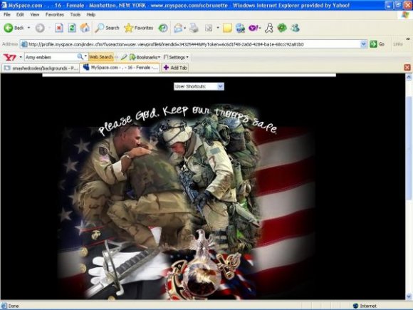
Nice layout love the marine type of design BUT if you are going to put some lyrics on a MARINE type of design the lyrics shouldn't be for the Army National Guard. Just thought i would give you a heads up
-PFC Sanchez

The font is very hard to read and I really don't like the navigation. However, I like the idea behind the lyt and I think the font you chose for the header is very nice.
thank you (:
and I want to make some more like this. I want to become a marine when i'm old enough. OORAH!


wow i like the border around the content, and also love the theme/message of this layout. it's different and actually has something to say. great job :)

im in love with it, im in the marines, so this is really nice =]


loveeee itt:] but yeah the contact box is a tad bit hectic but blazin:]

very nice. you should make the content area's width smaller because it looks like it's misaligned...or maybe it is?
Add Comment
You must be logged in to comment
Layout Details
| Designer |
smashedcodes
|
| Submitted on | Dec 27, 2007 |
| Page views | 11071 |
| Favorites | 52 |
| Comments | 14 |
| Reviewer |
S-Majere
|
| Approved on | Dec 27, 2007 |