Designer's Comments
Look carefully for specific instructions
Replace all the xxxxxx thingies with your friend ID
you can replace the marquee with your own icons or delete it or do w.e you like with it, the same with the vid .
in the friends section, replace all the ****** with your friends myspace url & replace the image url with a pic of your friend .
- DO NOT use this layout if you have no html knowledge .
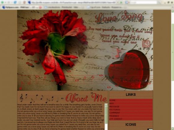
picture credits:
http://flickr.com/photos/cattycamehome/984335764/
http://flickr.com/photos/atillavibes/432264423/
Using This Layout
For specific instructions read designer's comments
- This is a div overlay layout, html knowledge required!
- 1. Log into myspace.com
- 2. Click on Edit Profile (Profile 1.0)
- 3. Copy (ctrl c) and paste (ctrl v) code to the specified fields
Layout Comments
Showing latest 7 of 7 comments

I THINK IT'S AWESOME!! BELLO!!

i think its good
THANK YOU for being one of the only people to have the useful picture link!
Most other layouts have the damn codes to send you to 'view pictures', which doesn't help if you have albums.
I do think that the layout is too big though, and joined the links into the about me, and no headings so the attention is on the picture.

The banner is a bit large, but I think the navigation and the content area are very nice.

It's not working on firefox...

I actually like this :). For me, its not too much, I think the theme overall is great. However, it is misaligned in IE but I see why; you only tested in FF. The fonts could have been better though. Not big fan of the color of the fonts and the solid color background. Other than that, great job.

this is way too much. i don't think you should've done the background for the content areas. i think you should've make the background for the body white and take the original background color for the body and replace the original background color for the content. use padding for the links. everything else seems fine. (this is just suggestion. everyone has different styles)
Layout Details
| Designer |
xRecclesz
|
| Submitted on | Dec 26, 2007 |
| Page views | 26,512 |
| Favorites | 201 |
| Comments | 7 |
| Reviewer |
brooklyneast05
|
| Approved on | Dec 27, 2007 |