Hayley Williams from Paramore (comments)
Displaying 1 - 17 of 17 comments

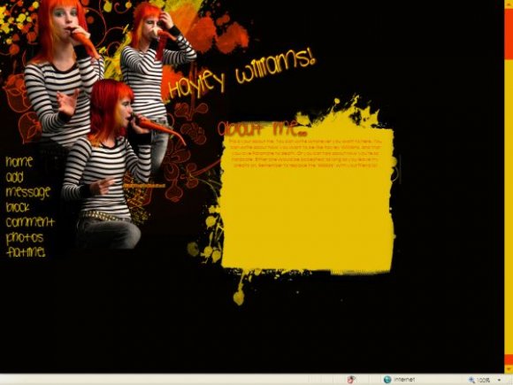
Very awesome layout. And it works well in Opera! If I ever decide to use a div it will prob. be this one!

hey what font did you use for the "hayley Williams" caption?


save the image as .png instead of .jpg. it'll be better quality.

I LOVE the image and rollovers (as does everyone else). In fact, I just love this layout. There are a lot of Paramore layouts on cB, but this is one of the best ones (Y). I'm going to suggest it to one of my friends.
Paramore are awesome, seeing them for the 2nd and 3rd time in Februaury!

nice. i like the rollovers. im not sure if i really like the font u used and orange font on yellow background isn't legible. but great use of brushes.

ahh!
very nice ^^
and yess......i agree u should darken the font..or make it bigger ;]

This is cool - but I think the font colour could have been darkened down a bit, as it's quite hard to read... (Well, for me, anyway..) (Y)
This is cool - but I think the font colour could have been darkened down a bit, as it's quite hard to read... (Well, for me, anyway..) (Y)


Add Comment
You must be logged in to comment
Layout Details
| Designer |
hospitalhorror
|
| Submitted on | Dec 24, 2007 |
| Page views | 20119 |
| Favorites | 75 |
| Comments | 17 |
| Reviewer |
brooklyneast05
|
| Approved on | Dec 24, 2007 |