Designer's Comments
Look carefully for specific instructions
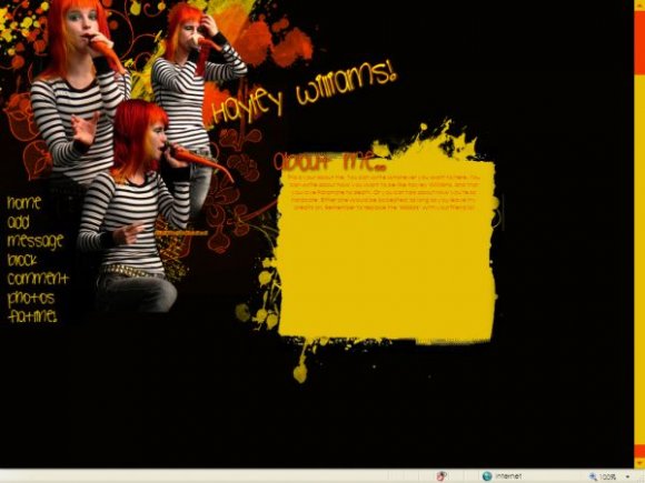
No, I'm not a fan of Hayley Williams or Paramore, but I was asked a ton of times to make a layout with them/her.
I don't know if it's just me, but everytime I submit a layout to CB, the images look runny and pixelated. It doesn't look that bad in the original.
You can find this layout and more on my website and my myspace.
---
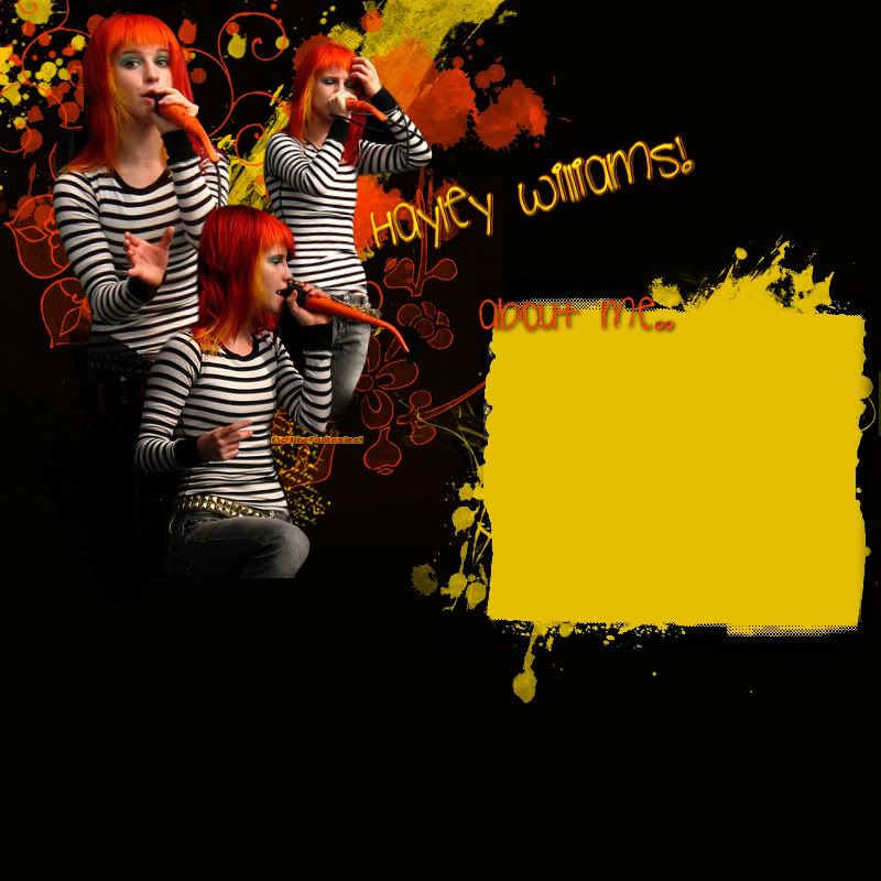
Photo Credit: Sound Fury
Font Credit: Kevin and Amanda
Brush Credit: Murexa
Made in Corel PSP X
Using This Layout
For specific instructions read designer's comments
- This is a div overlay layout, html knowledge required!
- 1. Log into myspace.com
- 2. Click on Edit Profile (Profile 1.0)
- 3. Copy (ctrl c) and paste (ctrl v) code to the specified fields
Layout Comments
Showing latest 10 of 17 comments

Very awesome layout. And it works well in Opera! If I ever decide to use a div it will prob. be this one!

thank you, and your layout is very very gorgeous :D
hey what font did you use for the "hayley Williams" caption?

i love her hair omg

save the image as .png instead of .jpg. it'll be better quality.

I LOVE the image and rollovers (as does everyone else). In fact, I just love this layout. There are a lot of Paramore layouts on cB, but this is one of the best ones (Y). I'm going to suggest it to one of my friends.
Paramore are awesome, seeing them for the 2nd and 3rd time in Februaury!

HOW THE FUXCK DO I PUT THIS ON MY PAGe
love the colors

nice. i like the rollovers. im not sure if i really like the font u used and orange font on yellow background isn't legible. but great use of brushes.

ahh!
very nice ^^
and yess......i agree u should darken the font..or make it bigger ;]
Layout Details
| Designer |
hospitalhorror
|
| Submitted on | Dec 24, 2007 |
| Page views | 20,118 |
| Favorites | 75 |
| Comments | 17 |
| Reviewer |
brooklyneast05
|
| Approved on | Dec 24, 2007 |