Piano (comments)
Displaying 1 - 20 of 22 comments

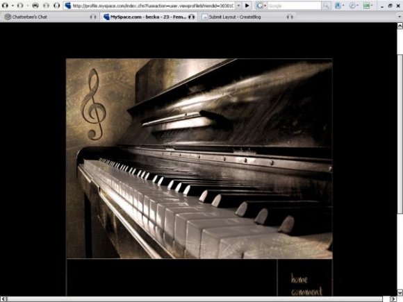
I LOVE the entire layout!
Beautiful concept!!!
I was wondering,
Would it be at all possible,
to do it in any other color tone,
such as blue?
AND can it be used on any other site,
such as hi5 or facebook?
Thank You! :)
someone already asked this but... did you ever create a picture link within the layout? if you did can i get the code. great layout.

Hey i have this lyout on my myspace and i LOVEEEE it. Theres just one problem with the about me section,.. the text starts lower then the about me box so now the text is half in the box and half out. Please check out my myspace (link below) and help me please.. Thanks :D
www.myspace.com/rhsbabiixa 17

Text is off in firefox. I can fix it but some people cant so you might wanna change it. =)
i have mozilla and i was wondering. is there anyway to make my music play automatically when my page opens with this layout?

i love the text you put as an example:
Put stuff about you here. Change the overflow if you want. This is stuff about me. lalala. my age, name, birthday, sex, location, hobbies. Whatever. lalala. this is my stuff. i hate you. i love music. my favorite color is navy blue. i'm a retard. i like to sing. i hate when people are stupid. i love my mp3 player.
you are so funny
does anyone know how to put videos on this div layout? everytime I do, it appears really tiny in a white rectangle... =[

Lovely.
The text for the preview is a little off, though.
Other than that, its pretty good.


i love the piano, but the text is a tad too light for the lyt
banging layout but i was wondering if you could add a picture link next to home please and thanks get back
Hey I love it, just wondering if its possible to still have all the information in the page such as interests, tv, and things like that

very nice. oh ic, u have't checked it on IE. i like the font u used for the navigation. a simple background would've been better for the content areas. other than that, beautiful~

Sorry, I meant the text is below the box. My mistake. :]
I love it. Fabulous work! X]
I do have one request if it isn't too much trouble: Could you possibly move the text up so it isn't outside the box? It might just be me but when I click to see a preview, the text isn't below the box.

It's nice & elegant, really classy, but it would be even better if u added some text..But in general it's nice [=

im currently using ff and the div is a bit misplaced =l
the banner is gorgeous. somewhat large though
I like the subtlety of the music notes in the banner; that's nice. It would have been nice to see some text though. Since the banner is so huge, it looks a bit empty with just the pale music notes.
It's a pretty nice layout. :]

Add Comment
You must be logged in to comment
Layout Details
| Designer |
Smarmosaur
|
| Submitted on | Dec 24, 2007 |
| Page views | 52806 |
| Favorites | 320 |
| Comments | 22 |
| Reviewer |
brooklyneast05
|
| Approved on | Dec 24, 2007 |