Designer's Comments
Look carefully for specific instructions
Note: The createblog live preview looks different from what the layout actually codes for, since the preview uses old myspace coding:
When used on myspace the layout should have a miniaturized myspace music player in the top right of the main table.
Copy the codes below and paste them in your "About me" and "Who I'd like to meet" sections.
Everything you have to edit is in the "Who I'd like to meet" section. Remember to replace the "xxx"'s with your friend ID.
Get your friend ID here!
I would not recommend attempting to use a Div if you're not at all comfortable with coding.
Please leave the credit on.
Thanks, and enjoy!
Using This Layout
For specific instructions read designer's comments
- This is a div overlay layout, html knowledge required!
- 1. Log into myspace.com
- 2. Click on Edit Profile (Profile 1.0)
- 3. Copy (ctrl c) and paste (ctrl v) code to the specified fields
Layout Comments
Showing latest 9 of 9 comments

this is really really nice ! :) its so my style! :)
By diputs on Apr 8, 2008 10:22 am

I changed the navigation for you!
:D
It's bold now; a lot easier to read.
By CrotchetTheLeper on Dec 27, 2007 11:58 am

this is very nice...i think you've done a fine job =]
By jesusisthebestthing on Dec 26, 2007 11:14 am

simple but nice. i think u could've made the navigation bold so that it's more legible. but i kinda..dont understand the theme?
By twodreamlovers on Dec 24, 2007 6:41 pm

great job =)
the nav is a bit hard to read.
By guccci on Dec 24, 2007 3:41 pm

pretty neat. the navigation is hard to see though.
By alecreations on Dec 24, 2007 2:01 pm

crisp and clean,. I like it
By IVIike on Dec 24, 2007 1:34 pm

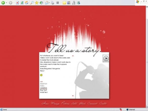
Wow, this is nice. I like the white spikes on the top.
By tokyo-rose on Dec 24, 2007 1:09 pm
the navigation could be better....but I really like it still =D
By Rochelley on Dec 24, 2007 12:58 pm
Layout Details
| Designer |
CrotchetTheLeper
|
| Submitted on | Dec 24, 2007 |
| Page views | 12,096 |
| Favorites | 76 |
| Comments | 9 |
| Reviewer |
IVIike
|
| Approved on | Dec 24, 2007 |