paramore. FIXED! (comments)
Displaying 1 - 20 of 21 comments


it is misaligned in firefox. not by a lot though. something must have been wrong w/ your ff. :] it lied to you.

I Love your layouts, & i want to start making them, anyway you can give me a jump start on where you learned how, or some helpful hints? :)

I like this layout. There arent very many decent Paramore layouts out there~ and I dont get why people are commenting on how they dislike the band...comment the layout, not the band. Nobody cars about your opinion n the band itself. -_-

i loveeeeeeee it.
hayley is so hot god damn.
but anyway :]]]

i think this layout is gorgeouss.
simple is good at times. :]

i'm sick of paramore, they were great before Mtv ruined them..now i can't stand them.
it's a little too plain though.


i love how theres a million paramore layouts and their like the worst band ever lol


I like this one, but I think more could have been done with it
This is alright - I like the image... but I think you could have done a bit more to the navigation links... make them change colour or something...

seemed mis-aligned in IE.
Maybe a more interesting bg wouldnt hurt :)


the image seems fun and cute, so i think you could have done more to spice up this layout. i do like the setup, though. ^.^

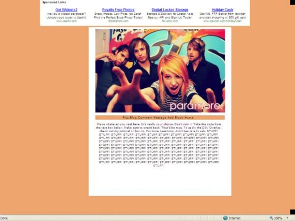
wow. i love the image. the colors are vibrant. nice. =] however the color u chose for the background seems dead...try to center it more. a more creative navigation wouldn'tve hurt. other than that, nice job.
Add Comment
You must be logged in to comment
Layout Details
| Designer |
broken-doll
|
| Submitted on | Dec 24, 2007 |
| Page views | 15371 |
| Favorites | 96 |
| Comments | 21 |
| Reviewer |
S-Majere
|
| Approved on | Dec 24, 2007 |