School time (comments)
Displaying 1 - 11 of 11 comments

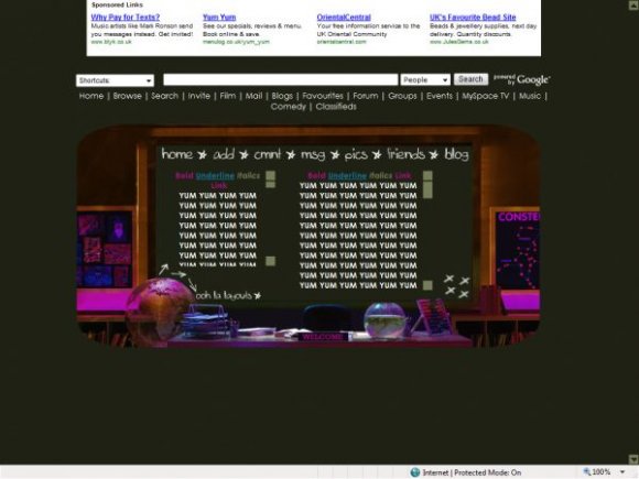
example when u zoom it its on the bottom
when you look @ it in its thumnail preview its centered
Posted by koobecaf on Feb 17, 09 6:20 pm
I like this, i just think that it should be a weeeee bit centered or up top a little bit. but other than this this is gorgeous
Posted by koobecaf on Feb 17, 09 6:19 pm


like everyone said the font is a turn off, but the main theme is awesome
Posted by IVIike on Dec 23, 07 2:39 pm


very nice. although im not so sure about the main font. however, it's creative. and instead of 2 divs i would've preferred 1, but o well. =] 2 gives more structure..?
Posted by twodreamlovers on Dec 22, 07 6:05 pm

yeah. i agree...the font is too big..the layout is great though
Posted by Imichelle on Dec 22, 07 4:52 pm


cute! I don rly like the biggness of the font, but i rly rly like the layout!
Posted by MaloneyBaloney16 on Dec 22, 07 1:14 pm
Page 1 of 1
Add Comment
You must be logged in to comment
Layout Details
| Designer |
oohlalayouts
|
| Submitted on | Dec 22, 2007 |
| Page views | 33236 |
| Favorites | 153 |
| Comments | 11 |
| Reviewer |
IVIike
|
| Approved on | Dec 22, 2007 |