Designer's Comments
Look carefully for specific instructions
to see this layout in action, visit www.myspace.com/diageoliamtest as sections of the layout actually move!
Using This Layout
For specific instructions read designer's comments
- 1. Log into myspace.com
- 2. Click on Edit Profile (Profile 1.0)
- 3. Copy (ctrl c) and paste (ctrl v) code to the specified fields
Layout Comments
Showing latest 10 of 14 comments

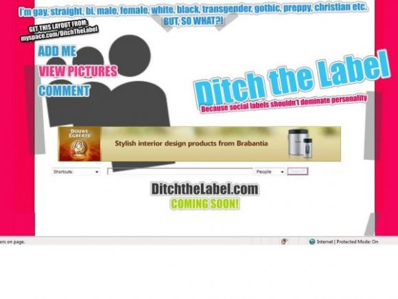
If it wasn't a giant advertisement and Just said the "I'm gay, straight, bi, male, female, white, black, transgendered, gothic, preppy, christian, etc. BUT SO WHAT?" and "Ditch the label" I'd probably use it.
Sure! The DIV will be available soon!
I LOVE THIS ! CAN YOU MAKE IT FOR DIV ?
Love this!

this layout is great =)
but it seems more like your layout or an advertisement for your site, than a layout for others to use

This is more or less an advertisement rather than a layout...
take out the big banner off the top
This is...interesting, but not something I'd use myself. I think that the right-side tables should all tbe same width. It looks awkward with the About Me's table so much thinner than the blogs and friend space.
I might use it sometime, if you make a Red & Black version, mostly dark. This is a nice concept, but it could still use some more style, not so much plain white, thats just too simple. Put some Vector shapes in a light gray color on the white, blend it in well, and also put it on everything else too, but have it blended well, with the right shade of the same color, for some style. It'd look real nice.

i like the bouncing text and i think the colors are cool
Layout Details
| Designer |
Tiggy121
|
| Submitted on | Dec 19, 2007 |
| Page views | 37,196 |
| Favorites | 103 |
| Comments | 14 |
| Reviewer |
digitalfragrance
|
| Approved on | Dec 20, 2007 |