Retro Love (comments)
Displaying 1 - 20 of 29 comments

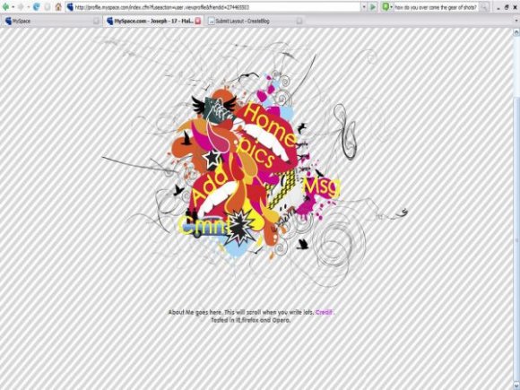
Haha, ya. I made this a LONG time ago.
I havent made a layout for well...since 08.

Holy crap that text is choppy. Also, the background doesn't repeat well. Otherwise, this is good or errm..practically better than all your other layouts.


i love this :D i've been looking for something like this for awhile :D
I just wanted to let everyone know that you dont have to keep the credit link on the about me.


LOL, all you did was steal someone else's wallpaper and add some ugly font.

i like but how? where? will i be able to put music on da page ?

i love the originality but it does need to be touched up. and it is sooo missing that 'ZiNG!' it needs. :]

nvm i see the about me sorry, but It still needs some snazzing up =/
I like the layout, but I feel like u should have added an about me section and comment box. It would still be very minimal but would have more to it.

I like it a lot....how did you learn to make layouts?

i love it!
the stripes are perfectly opposite to each other, and it looks very nice!


okay so i realllly love this layout, but i have no clue with how to use HTML coding. can someone, anyone please help me?

hint for the future... dont try and blend your picture and the background. just make the picture have a transparent background when you make it. and save it as a .png
makes things look a lot better and more professional.. other than that and the nav font i like the design of it =)
Add Comment
You must be logged in to comment
Layout Details
| Designer |
Maccabee
|
| Submitted on | Dec 19, 2007 |
| Page views | 64773 |
| Favorites | 375 |
| Comments | 29 |
| Reviewer |
digitalfragrance
|
| Approved on | Dec 20, 2007 |