Designer's Comments
Look carefully for specific instructions
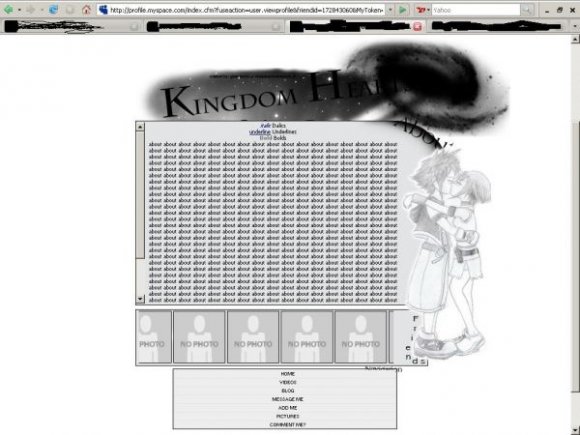
Replace The "XXXXXX" With your Friend ID for "add me" "message me" etc..
The ones lower in the HTML/CSS are for your friends Friend ID's, replace the image link with your own friends image, it will automatically be resized, so don't worry. n.n
This layout works with both FF and IE.
Replace the About me with whatever you want. It doesn't matter. Music players will work, so you may use them if you want to. n.n
Annnndd, That's about it. :D
I think it's a pretty cool layout, but it's up to you all. n.n
Using This Layout
For specific instructions read designer's comments
- This is a div overlay layout, html knowledge required!
- 1. Log into myspace.com
- 2. Click on Edit Profile (Profile 1.0)
- 3. Copy (ctrl c) and paste (ctrl v) code to the specified fields
Layout Comments
Showing latest 7 of 7 comments

How can we see the friends image?
Er, Well..
Reason You can't see the top font is because you're screen isn't as bright as mine.
I have a flat screen, and it's very bright.
So I can see the top font fine.
And why don't you think the navi goes with this layout? o.o

yeah i agree w/ that top fnt thing. and the navi is very nice, but i don't think it goes w/ this layout/
This is cute. I agree with alecreations; "Hearts" should have been made easier to read. Also, the content area is a little plain. It's nice though.

very nice. simple and cute. however, u cant see the font for the image nor can u really see "about me" and "navigation". i think u should've made the picture contrast more so the color black would pop out more.

agreed. nice

You can't really see the top font. other than that, this is nice.
Layout Details
| Designer |
CoOkIeCrUm69
|
| Submitted on | Dec 18, 2007 |
| Page views | 15,971 |
| Favorites | 51 |
| Comments | 7 |
| Reviewer |
freeflow
|
| Approved on | Dec 20, 2007 |