Maroon.Brown Layout (comments)
Displaying 1 - 20 of 21 comments


this is awesome, but could you make a black and white version, that would look awesome


Nice layout. I really like this concept - it reminds me of a LiveJournal layout. Is there any way to modify it so that you can add an additional sidebar for "links"?

Haha, I thought this was by fainaru at first too, lol. xD
Still, good job! =D

OMG this layout is awesome. ive never seen anything this simple, yet so proffessional. its like, its orgasmic LMFAO!
good job at making it!

I like it! Im not a fan of the colors used(however,they do look well together for the layout) I still may use it :)


Ah, simple, yet it has everything you need on a MySpace. I like it :)
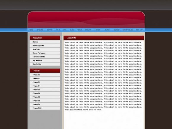
I don't have anything negative to say about this layout. But I think it would look even better if the blue were darker, or maybe a black instead of a blue, but thats just me.

I really like this one. Nice job. Very simple and clean.


Wow lots of great layouts today.This is really nice.and I agree about the whole blue nav bar prob.

WOW my favorite colors!
I agree about the navigation too.
You should make this into a website template too I would defiantly use it if it were a website template, because I am looking for a nice one!
BTW go see my website at...
http://thenickman.pill- pop.net/

I dislike the navigation as well, the blue is just randomly there. The preview link doesn't show the background under 'about me' for me though. but from the screenshot, it looks nice. Good Job. =D

awesome. i like how simple it is. and i like the navigation

I thought this was by fainaru at first...
I really like it except I agree with twodreamlovers about the nav.
Add Comment
You must be logged in to comment