Designer's Comments
Look carefully for specific instructions
Slightly more advanced than the others but still pretty easy to manage and install into your myspace.
If you don't want a comment box in the section named 'comment' you can change the text for the title which is contained within the p class titles named header 2. If you want a matching background to go in your own custom comment box, replace the image URL given to the following URL:
replace YOURFRIENDIDHERE with your friend id.
message me if you want to change the coding to suit yourself or if you are having any problems.
will be creating a girlier version of this layout when i get the time to create the style sheet.
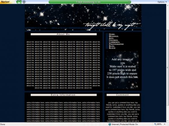
Brush credit for this layout goes to JS Scully from deviant art.
works perfectly fine in all versions of internet explorer and mozilla firefox, but is best viewed in updated IE explorer as the allignment is better. if anyone knows the code to keep the layout center alligned in all versions of internet browsers please PM me! would be a massive help.
(: hope that's everything.
Using This Layout
For specific instructions read designer's comments
- This is a div overlay layout, html knowledge required!
- 1. Log into myspace.com
- 2. Click on Edit Profile (Profile 1.0)
- 3. Copy (ctrl c) and paste (ctrl v) code to the specified fields
Layout Comments
Showing latest 10 of 13 comments

thats in firefox btw (y)
the navigation div would be better as its overflow:fixed instead of auto
it would make the links more neater when you click on them
nice work
x

How do you get the comment box to work? I have tried so many different sites for the comment box and none of them work at all, i place it where it says "commentbox" and nothing appears...why?
oh thankz lots i like this layout...i'm using it....lol...

fixed comment button and changed navigation slightly. ddint want banner to be too over the top. thanks for the comments (:
over all i love this layout...if you can please fix the comment link...then it'll be perfect...=)
omg the comment link doesn't work...u should fix that
The headers should be fancier. Otherwise it's a nice layout.

i see the details..

navi could be better/diff font :)
Layout Details
| Designer |
vintage-toile
|
| Submitted on | Dec 17, 2007 |
| Page views | 24,239 |
| Favorites | 163 |
| Comments | 13 |
| Reviewer |
freeflow
|
| Approved on | Dec 17, 2007 |