Supernatural 2. (comments)
Displaying 1 - 11 of 11 comments

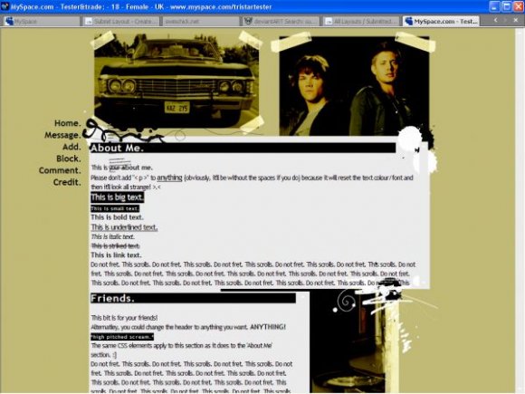
I LOVE this show & this layout is okay/average. I don't like the yellow/gold color you used..I think it would have looked better in a darker color...maybe blue, green, &/or black. Also, I don't even know what the picture next to the "friends" section is...I think another picture of Jensen & Jared would have been better there, but besides that...the setup is cool & I like the brushes you used & it works fine in IE.
That's because I didn't test in firefox - because I don't have firefox... sorry people (with firefox)!

i liike this...i've never watched supernatural but i think this is cool

Uhh, I'm not sure what to make of that comment... thanks and... Uhh, I'll bare that in mind. :]

i dislike the setup and the navigation. but i like the brushes and images you used.
It loads for me in IE...?
And yeah, if I changed the b/g colour to the image one, it'll look weird in IE but the same colour in FF, I think. =/
And you can change the font if you want to...?
:]

nice setup. never finishes loading..for IE. i can see part of the original for FF. the background color and the image background color aren't the same for FF (i think it's impossible for it to be same, but jus saying) the only thing i don like is the gray and black color and the font itself. everythign else seems fine to me =] very creative.

Add Comment
You must be logged in to comment
Layout Details
| Designer |
PaintMyFace
|
| Submitted on | Dec 15, 2007 |
| Page views | 11647 |
| Favorites | 29 |
| Comments | 11 |
| Reviewer |
karmakiller
|
| Approved on | Dec 15, 2007 |