Simple Div Part 2 (comments)
Displaying 21 - 40 of 45 comments

I apologize for any inconvenience. I am going to test this layout myself; to see if the links work.
However, it will take some time because since its the holidays im leaving for like three days. =/

Ok... I have tried over and over again to enter my user id into the add me section. It is still not working as far as adding me as a friend goes. EVERYTHING else in that bar works fine... Any chance I over looked something? Thanks


YEA i tried this DIV. And It was woking fine until when i went to the bottom of it and my "INTERESTS" SECTION WAS SHOWING!
TELL ME HOW TO FIx IT CAusE I TRIED HIDING IT AND IT DIDNT WORK..


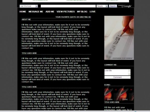
the picture 'express yourself' can be changable. Look for the image url above the 'comment me section' and below the 'navigation.'

Can I change the picture that says "express yourself" ?


the icons are covered up in FF. this is very nice. simplet yet it has everything. i love the structure of it. however, i would've chosen a different overall font and add even a little bit of color because the white and black makes it a bit too dull. but very nice overall. :]
Thank you for all the comments and suggestions. Yes, there is a way to make the links not turn white when you hover over them. Private message me to know.

Is there a way to make the top links not turn white when you hover over them?

Nice this is alot more snazzier than the first.Simple and so well organized.I love it.I'm putting it on faves.

reminds me of a wordpress theme or something. this is really nice.

I adore how elegant and functional this layout is. Outstanding work.
Add Comment
You must be logged in to comment
Layout Details
| Designer |
alecreations

|
| Submitted on | Dec 13, 2007 |
| Page views | 74888 |
| Favorites | 540 |
| Comments | 45 |
| Reviewer |
S-Majere
|
| Approved on | Dec 13, 2007 |