The Honorary Title (comments)
Displaying 1 - 20 of 35 comments

For some reason section about me shows a blank space. How do i fix it?
Thank you

I absolutely love this layout.
I keep changing my layout, but I keep coming back to this one.
Plus, I just adore The Honorary Title.

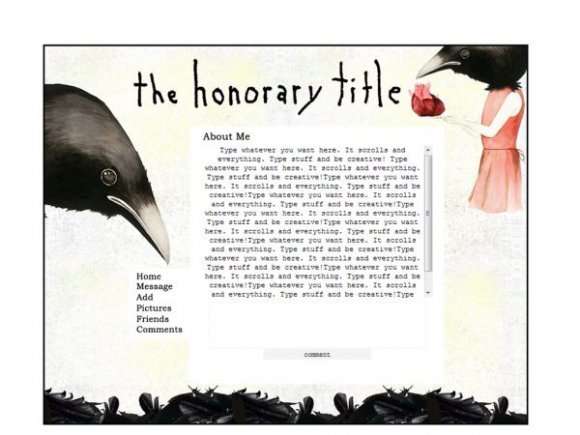
I like this layout but it's way to boxy. It may need more div overlays. I really wanted to use this T__T.


I like it...but idk what the honorary title is? Is it a band?

aparently,
there are alot of douche bags looking at this layout.
bacause i find it amazing,
simply because it is.
so,
good work.
and dont listen to complaints.
Removing The Honorary Title and putting lyrics is kindof lame, since these graphics are from their new album, but if you like it then it's cool for you.
Erm not sure why it added some spaces in that URL previously.
Just a fair warning.
I didn't plan on resubmitting it. :P
I am having trouble adding a link though, I don't know if you could be of assistance or not with this.
I think I'm making it harder than what it really is.
If you're curious to see what all I did to the layout, here you go:
http://img166.imageshac k.us/img166/4770/layout2uc2.pn g
Well, there is a difference from editing it to make it your own, and adding another link. It's just rude to take someones work and edit one small detail and resubmit it, when half the people here can edit it themselves.
Just a little note: you may want to change your notes then considering that you did say that we could resubmit it. :P
Edit it for your use as much as you want, but please don't resubmit it, but your own use it encouraged. As for the font, it's a 16 px Bookman Old Style I believe.
I'm editing it up since you said you don't mind and I thank you for that.
I'm wondering what text you used for the Nav bar so I can go about adding more links.
I love the crows but I also love gore as well so I touched up the crows a little and I may add some blood splatters here and there and see how that turns up.
Thanks again.

Editing the original image an adding "Blog" to the navigation. As for removing ads, Adblock works for Firefox.
P.S. Any way I can go about adding a Blog link to the navigation bar?
I found a code to remove the search bar all together.
Thanks though.
Any way to go about removing the ads? :P
Or not so much removing but covering them up?
Haha you probably wouldn't want to go about talking about that considering it's against their rules but I'm a risk taker.
Add Comment
You must be logged in to comment
Layout Details
| Designer |
AppleGeorge
|
| Submitted on | Dec 7, 2007 |
| Page views | 22932 |
| Favorites | 119 |
| Comments | 35 |
| Reviewer |
S-Majere
|
| Approved on | Dec 7, 2007 |