Demolition Lovers (comments)
Displaying 1 - 20 of 20 comments


Oh, and it's like halfway covering the ad too...but you already knew that. Oh and, "pm"?
Okay, I've been having some problems with your layout. Normally I wouldn't ask for help but I really like your layout. My comment box is not working and you can't view my pictures. I've replaced the "XXXXX" with my ID, and I'm still baffled as to why it isn't working. So when you get the chance, please help me out a bit.
yeah i know it shouldtn't but it was. hey is it ok to replace the picture on the top of the page??
i finally found a layout i like. maybe u can use this layout wt a diff. image something pink and black would be nice thanks


This is sad... and dark which I wouldn't normally like, but I like this

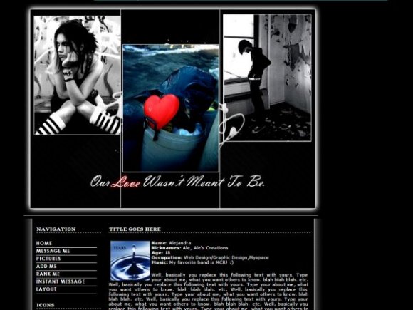
the outer glow looks awkward to me. it'd be better if the middle image was black and white except for the heart. it's half covering the ad and the navi's messed up in FF. but everything else, i love it =]


Yeah something goes on with Createblog's previews. Its not suppose to be covered, though. at all.

great job. i like the outer glow, but the image and the div dont seem to "attach" to each other. and, im not sure if this is how it looks in other browsers, but the iamge looks like its "attempting" to cover the ad at the top, but didn't do a very good job.

Add Comment
You must be logged in to comment
Layout Details
| Designer |
alecreations
|
| Submitted on | Dec 7, 2007 |
| Page views | 64613 |
| Favorites | 452 |
| Comments | 20 |
| Reviewer |
digitalfragrance
|
| Approved on | Dec 7, 2007 |