Designer's Comments
Look carefully for specific instructions
2) This does involves HTML knowledge but if you need help on how to use this layout, just ask me on myspace.com.
3) Replace the "XXXXXX"'s with your friend ID and if there's friends PICs, replace "friendidhere or whatever" with your friends myspace URL or you can just delete it.
Please do not jock, and claim this layout
as yours. I wouldn't want to find a layout
like this that has ur hands all over it. >:|
Using This Layout
For specific instructions read designer's comments
- This is a div overlay layout, html knowledge required!
- 1. Log into myspace.com
- 2. Click on Edit Profile (Profile 1.0)
- 3. Copy (ctrl c) and paste (ctrl v) code to the specified fields
Layout Comments
Showing latest 10 of 15 comments

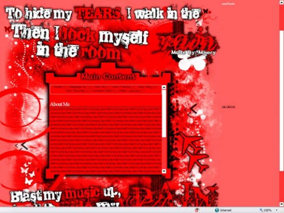
This is a little bit too loud- the stark red and white-white clash. Maybe if the white in this were tones down to a light gray or something? But I love the idea and see what you were really trying to do here. A for effort. It's good!
nice brushes. totally awesome [:
hEy.. iM uSiNg 1 oF uR lAyouT.. uhMm, cAn u teAch me hOw t0 fiX d coMment thiNgy.. **tHanKs! (Ybba91@yahoo.com)
WOW Amazing!I Luv This!
GrEaT JoB!!!!!
ITS RED 8D
I like it very much. Good Job!!
Thank you guys for the comments. ^^
too much red. too bright. the brushes are just...too much. im not sure if i like the font. however, the set up is nice.
it would be a little bit better if you used a little bit more colors.
it looks like it's a bit "too much" and it looks somewhat blurry in my eyes. but i really like the fonts you used and the brushes.
you could've spiced up the nav a bit more and added a comment box :D
Layout Details
| Designer |
MiseryLayouts
|
| Submitted on | Dec 6, 2007 |
| Page views | 29,428 |
| Favorites | 183 |
| Comments | 15 |
| Reviewer |
IVIike
|
| Approved on | Dec 6, 2007 |


