Eternity in Dreams (comments)
Displaying 1 - 17 of 17 comments


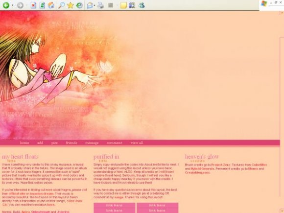
Everything about this is beautiful. The colors, the banner.. I love it!


okay. i'll edit this so the ad can show. (i'll work on this tonight..school's keeping me busy right now).

I love it. 3 Columns looks goood on a myspace :] Navigation links are cool and the background to them. And the banner is good :) You should just make the background colour on the banner transparent so the ad at the top shows :]
Good joooob
@ rawrio
i noticed that sometimes it does, but i didn't intend for it to do that. other times the ad will just overlap it... i guess i should crop the image; if you highlight the banner image you'll notice it takes up the space where the ad is usually located.
i'm sorry. i'll try to fix that.
anyway, thanks everyone for your comments :)


The colors are great, but the banner image has far too much empty space on the right.


Very nice.btw I don't see what's do cool about FF.I think FF sucks.[on my computer it sucks anyways]


lol i know it must look so weird, but i'll get firefox some day. um but for now this layout is only compatible with I.E. thank you for commenting, i appreciate it. :)

i think u really should get firefox cause ppl are gonna start shouting at u about misalignment...i know...that happened to me. lol. other than that, it's beautiful. the colors and the image. (although i would've blurred it a little so it wouldn't be too sharp) nice job =]
Add Comment
You must be logged in to comment