Oh My Valentine (comments)
Displaying 1 - 20 of 21 comments

It's a very lovley layout. It just bites that if you have the new myspace apps on your profile it interferes with it.

I must agree with LadyRin. this is definitely one of the best layouts I've seen. and Vincent was my favourite character. (:
one question though, if you don't put a lot of stuff in the div, will it still be as huge, as I'm fond of small layouts. (:

yo dude culd u tell us what lang the writing is on this pro thought it was latin but cant wouk it out x

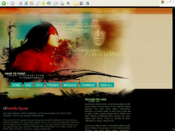
This is by far one of the greatest layouts I have seen on this or any other website. The background was VERY nicely made. The over layering, fading, wording, and brushes where perfect! The design of this layout went great with the background. Good choice of color in background and font as well. All in all it's a great layout and one of my favorites. Great job!
Yeah, it does hide the Advertisement at the top. That, and the fact that the navigation doesn't really suite it. Its okay, but I personally think it could have been better. It kinda looks like its stretched a bit too, as if you either didn't make the main graphic, or you made it separate, and then after you merged the layers, or finished it, you changed the size of it, and it happened to stretch it.


This is amazing. Seriously.
I'd use it but I'm content with my profile right now.

these colors & the banner are just great...i love it.

Wow I'm very impressed.It kind of looks like a website template which is awesome,and the navigation and content area looks awesome.then the image is also great.Great job.you're very talented.


@ twodreamlovers
:D thank you for the suggestion. i'll keep that in mind for the next layouts i make. and the layout does not cover up the ad. at least.. it's not supposed to. anyways, thanks!

pretty awesome you fixed it. Looks awesome now that the nav is in view. As I said before i liked it and text headers look awesome.

this is ur first myspace layout? wow...u did really well. i just LOVE the image. the only thing i don't like is the navigation...i think u should've put it in a side module. btw, it looks fine in FF, it's just that the navigation is about 5px belower than where it's supposed to be. btw, does this cover up the ad? anyways, nice job =]
thank you! :D
@ mikxoh:
hmm would it be better if the links were smaller? (and if anyone's wondering, they're supposed to overlap the header image like that). i like how they look though :) but thank you for commenting.


Add Comment
You must be logged in to comment