Designer's Comments
Look carefully for specific instructions
DO NOT REMOVE CREDiTS !
Using This Layout
For specific instructions read designer's comments
- 1. Log into myspace.com
- 2. Click on Edit Profile (Profile 1.0)
- 3. Copy (ctrl c) and paste (ctrl v) code to the specified fields
Layout Comments
Showing latest 6 of 6 comments

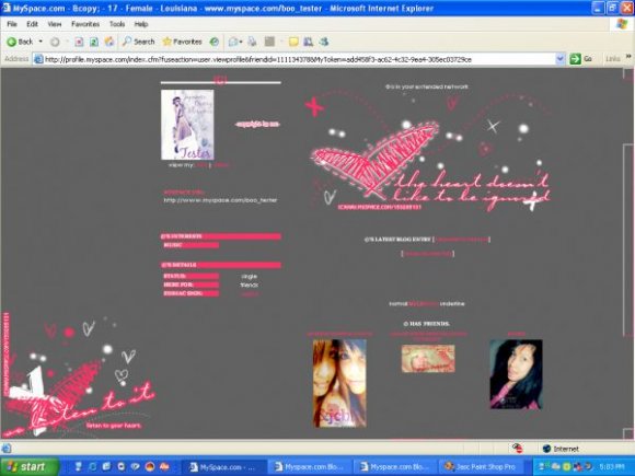
the colors pop nicely...
By roglows on Mar 1, 2008 10:48 am
i was going to use this, but i hate how it made my pics and icons really tiny on just the right side. and dont like transparent layouts, if it wasnt for those things i would use this for sure! props for everything else tho
By MiSZCRiSTiNA on Dec 2, 2007 12:32 am
The links are messed up.
Overall, it's neat.
By imperfectionn-x on Dec 2, 2007 12:03 am
i mean the links lol
By TaintedSakura on Dec 1, 2007 6:51 pm
I like the simplicity of it. Its very cute :D
I dont mean to be a bother but why does the font look like this for me?!
http://i22.photobucket.c om/albums/b309/JanieMB13/uuuty ujgdg.jpg
By TaintedSakura on Dec 1, 2007 6:48 pm
it's a bit plain for my taste, but the image quality is good
By IVIike on Dec 1, 2007 6:28 pm
Layout Details
| Designer |
japanesecherryblossoms
|
| Submitted on | Dec 1, 2007 |
| Page views | 42,776 |
| Favorites | 191 |
| Comments | 6 |
| Reviewer |
IVIike
|
| Approved on | Dec 1, 2007 |


