Follow The Path (comments)
Displaying 1 - 20 of 31 comments

just add a background with black or just a black colored background then you"ll see the Navigations, and you can see that it will fit the top black div.
Love this layout. Genius. Just one question: How do I get it to center on the page. It's stuck in the top left hand corner. I've tried like ten different codes, it won't move.

I love the work you've done here! Just a quick question...after reading your FAQ's, I was wondering if it was possible to change the background images in the DIVs? Just curious :)

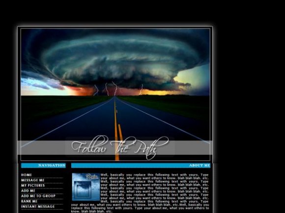
life is a highway i wanna ride it all nite long -cool layout
Nice template, I've used it, and kept your credit in.
My images don't show up. When I paste the url of your image, it works. When I type in my url it doesn't. When I copy back the url I typed in, and paste it into the address line of a blank IE browser, the image shows up in the new browser, so the url is correct. I'm stumped. Any suggestions?
Sometimes only a white outline of the image will appear with a square and x inside. The properties of the box are correct and url leads to the image. But "Show Image" does not show the image.
Walt B

as long as my credit is intact; and you don't distribute it. its cool. :)
i love the layout.
i took out some of the navigation and replaced basics, icons, and friends with something else.
but your credit is still there.
is that okie dokie?
For blogs add this link to the navigation:
http://blog.mys pace.com/index.cfm?fuseaction= blog.ListAll&friendID=XXXXXX
if you don't know how to, PM me.
Sorry to comment twice..i wanted to let you know that everything is running beautifully. if you could send me the code for blogs, that would be awesome. :-) thanks
I love all of your DIVs...i like how you have everything laid out..and you put plenty of space and I like it!
=]

I like simplicity. and the image was way different, i enhanced the color. :/

the image is way to plain IMO and the image quality could be improved


i love the image it looks great. but your nav isn't really lined up, unless that was intentional. also, the section for icon, is a little bit small don't you think? i man a lot of icons are a little bit bigger than that. other that those two things i think you did a great job!

very nice. it's a bit mislianged (with the banner and the background) by like 2px. i would've gone with a darker blue for the background color for the header. i LOVE the structure. nice job.
Add Comment
You must be logged in to comment
Layout Details
| Designer |
alecreations
|
| Submitted on | Nov 30, 2007 |
| Page views | 43313 |
| Favorites | 318 |
| Comments | 31 |
| Reviewer |
S-Majere
|
| Approved on | Nov 30, 2007 |