Designer's Comments
Look carefully for specific instructions
do not take my credit off, its really small and un-noticable.
if you use be sure to add me
Myspace
Ridicullo
Using This Layout
For specific instructions read designer's comments
- This is a div overlay layout, html knowledge required!
- 1. Log into myspace.com
- 2. Click on Edit Profile (Profile 1.0)
- 3. Copy (ctrl c) and paste (ctrl v) code to the specified fields
Layout Comments
Showing latest 6 of 6 comments

This layout is not good looking. I know you worked hard on this but...you used
insane-asylum-pea-green ( or at least it's pea green to me. It's SOME kind of green) with Khaki. The colors just...are not attractive together at all. And I agree with the others that the background doesn't match up at all, giving it a choppy look, like it's been pasted together. Also, the scroll bar looks 'oddly shaped' for some reason- I mean the cardboard it's on. Idk. Thank you for taking the time to post this and for working so hard on it. I can look at it and tell you worked hard on it, and probably got frustrated with it at some points & did everything you could to match the background before you said 'the heck with it'. I get it:DD Take care.

this is nice, but the nav is a little too small

I like this, but I agree with silentSCREAMS. Your background image doesn't line up.

I like it. :)

i agree with silentSCREAMS. ur image is bold but everything else is sloppy-ish. stick to one theme.

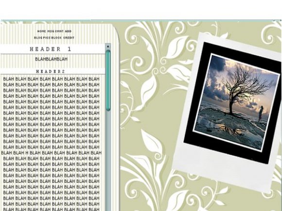
I think the polaroid looks a bit out of place. The colors kind of clash, but it in a mismatched matched sort of way. I'm not sure about it.
I think it was a really, really bad choice to put the background in the image. It doesn't line up with the background.
Overall, this is pretty good layout. I love the headers.
Layout Details
| Designer |
jerrys9
|
| Submitted on | Nov 29, 2007 |
| Page views | 19,467 |
| Favorites | 91 |
| Comments | 6 |
| Reviewer |
digitalfragrance
|
| Approved on | Nov 29, 2007 |