splat. (comments)
Displaying 41 - 60 of 65 comments

Thanks everyone ;)
i'm going to make a new stylesheet and style of layout soon, i'll probably be more... inspired to brush it up on those.
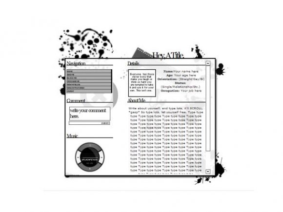
If you aren't seeing the whole layout, you're probably on a mac, and I don't know how to fix that. CB approved it, so I figured it was fine on all browsers.
Plus, I have a weird difficulty with the title, aligning. FF is a tad off, IE is just right, but, thing is, I coded it in FF.
T.T

Wow! Awesome layout! =D
The only complaint I have is the blurred brush, lol.


it's nice but i wouldn't say it's the best. i think u could've done more to the layout with the brushes.

I thought this was someone else's first ;) You kind of have a similar style as IvIike. I think you could have done a little more brush wise.

it looks nice, but i think you should add
overflow-x:hidden;
to the navigation side because the scrollbars messes that side up
outside of that the title section doesn't align right on Netscape but the layout looks fine in everything else.
not the best I've ever seen but its not ugly nor bad.


Hey, you need to fix the layout code.. you only get half of it. :)


i really like this. i didnt think it was too hard on the eyes.


didnt notice blurry splat until i read other comments, i still really like it!


ack! the splat..hurts my eyes as well. but i do love it! especially the song ^^ haha
Thanks everyone
THe only reason I blurred it is because it was so pixelly.
Add Comment
You must be logged in to comment
Layout Details
| Designer |
silentSCREAMS
|
| Submitted on | Nov 27, 2007 |
| Page views | 71875 |
| Favorites | 518 |
| Comments | 65 |
| Reviewer |
IVIike
|
| Approved on | Nov 27, 2007 |